Attention is shared.
The interface is one part of a larger environment. A clear first read matters more than visual novelty.
A little more clarity.
A little less to carry.
Ammunition state for armoured-vehicle crews and the fleet that keeps them supplied. On a rugged tablet in a hot turret, hierarchy, contrast and a few well-placed decisions make a dense screen readable at a glance.
Follow the design story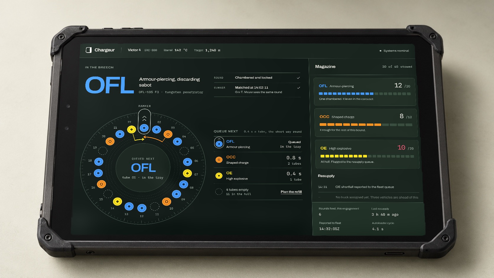
A tablet doesn’t exist in a vacuum. Neither does the person using it.
Chargeur tracks ammunition across an armoured vehicle and the fleet that keeps it supplied. It is read in a hot turret at night and on a rugged laptop at a forward base. The design question is a human one: how much work does a screen ask someone to do?
The information was always there. Our work was in what it asks of the crew: what gets noticed first, what stays readable through a vibrating hull, and which sums the screen can do for them.
Consulting engagement delivered with a partner agency. Vehicle, unit and programme identifiers have been altered; the process and outcomes are real.
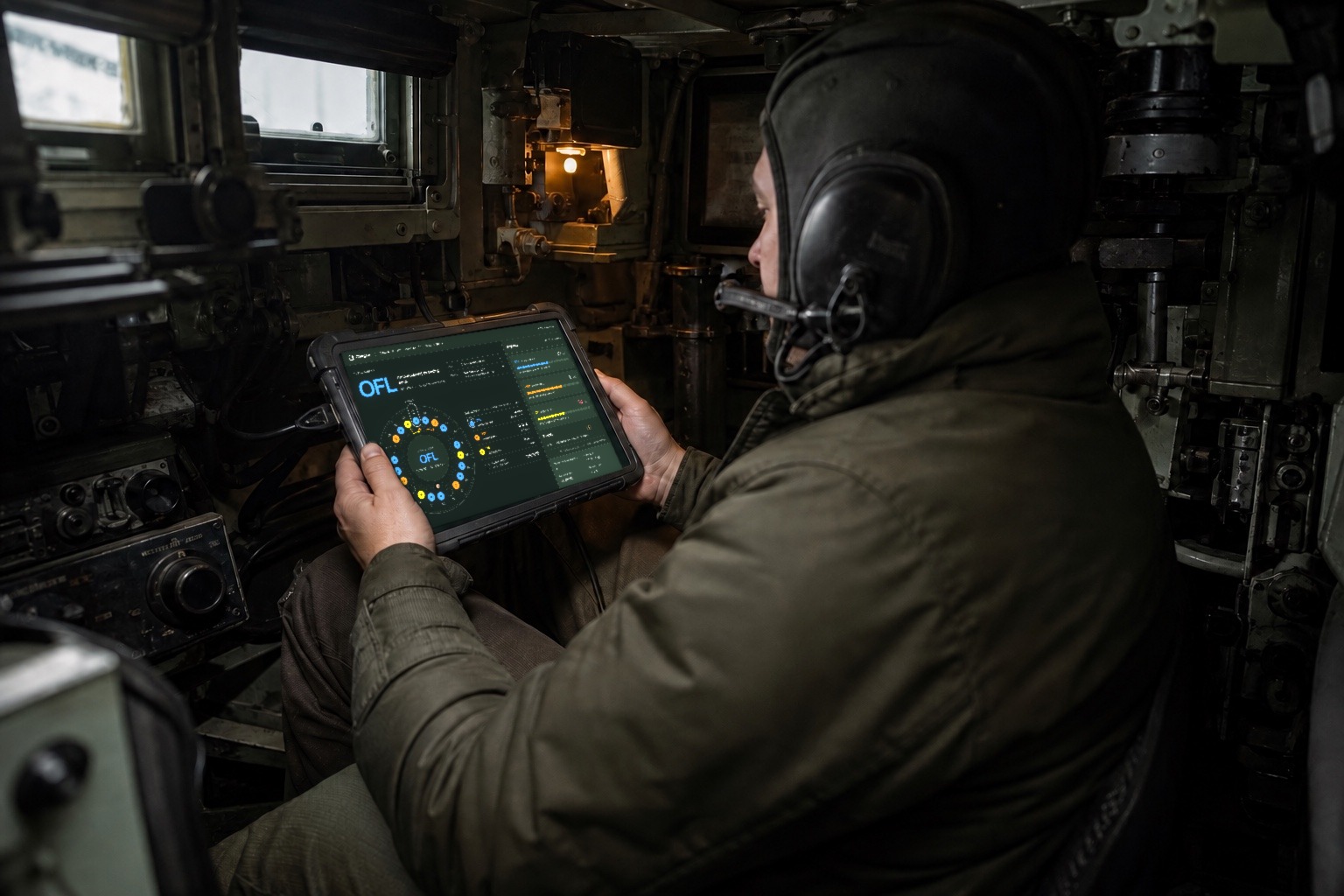
The interface is one part of a larger environment. A clear first read matters more than visual novelty.
Light, viewing angle and gloved touch change by the hour. Contrast, colour and target size are set for the worst of them, not the average.
Restraint shouldn’t erase useful context. The challenge is giving dense information an understandable order.
The visual direction starts with three commitments. Each one has to earn its place on the screen.
Use a deliberate type scale and stronger grouping. Let the most prominent information establish the reading order; give supporting details enough contrast to remain useful.
Pair colour with text and structure. A colour can help someone recognise a category, but the label should still make sense without it. In the carousel, every ammunition family also carries its own primer mark.
Warm neutrals, measured spacing and direct language bring care to a technical interface. Decoration stays quiet so the content can be clear.
A screen is read in pieces. These sketches frame the experience at a glance, during a closer look, and when returning to detail.
One dominant element provides an entry point into a dense composition.
Parallel panels and explicit labels give the comparison a consistent structure.
Repeated alignment and a steady type system provide familiar places to look.
What every screen is checked against: does the intended reading order match what someone actually notices?
Each screen has its own spread, in the order a day uses them: the turret, the halt, the disagreement, the fleet, the hour ahead, the fix and the queue.
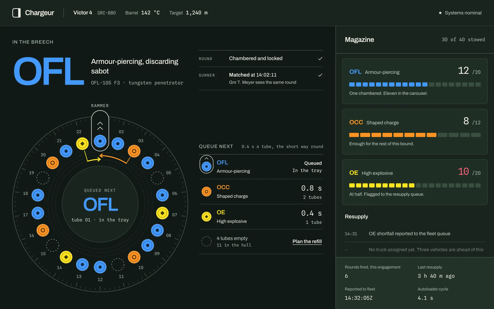
The round in the breech gets the largest type on the screen. Beside it are the two things a commander checks before firing: the round is locked, and the gunner sees the same one. Below, the autoloader is drawn the way it turns: tubes ride past a fixed rammer tray, and whatever sits in the tray is loaded next.
Beside the ring, a table reads across: each family, how far its nearest round is from the tray, and the seconds to turn it there. The queued round is marked with the tray itself, the outline the ring draws under the rammer.
Does the ring still read with the colour turned off? Each family has its own primer mark for that.
 View full size
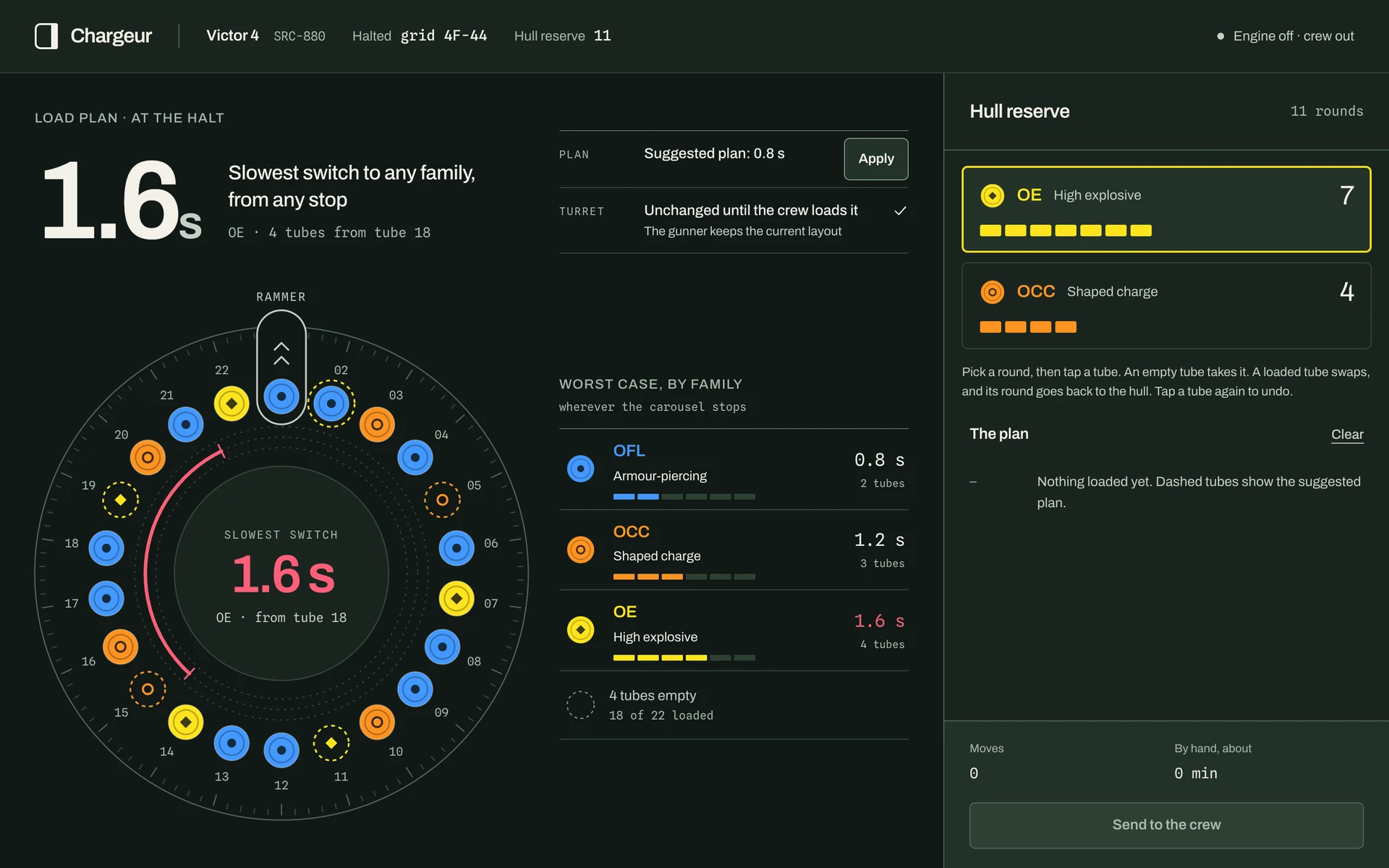
Four tubes are empty and the hull holds eleven rounds. The plan asks one question of every layout: wherever the carousel stops, how far away is the nearest round of each family?
OE was four tubes from tube 18. The suggested plan fills the empties and swaps one OFL back to the hull, and every family ends up within two tubes. The suggestion is the best of every combination, not a rule of thumb.
Is a dashed outline enough of a hint, without taking the decision away from the crew?
 View full size
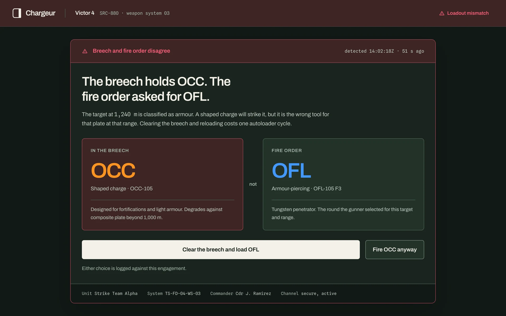
The two panels share a visual structure: a label, a large value and supporting text.
Alignment does some of the explanatory work before a paragraph is needed.
Can someone describe the two groups without relying on their colours?
 View full size
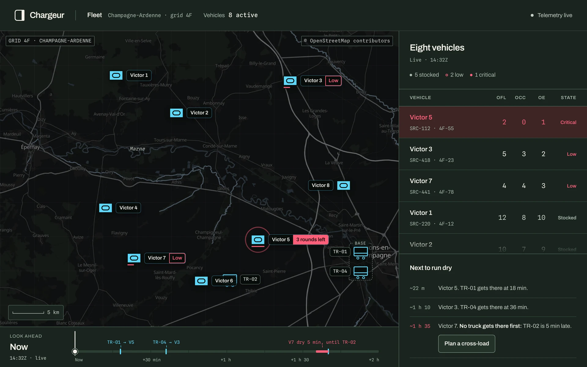
On a busy road map, our vehicles carry the one saturated colour: the filled friendly frame from NATO symbology, with the armour track inside. The map underneath is muted so nothing competes with them.
A diamond is the hostile frame. Ammunition state rides on a label and a bar under the frame instead: outlined and half full when low, solid and full when critical. A vehicle running dry never reads as an enemy.
Do the markers hold up over the busiest part of the map?
 View full size
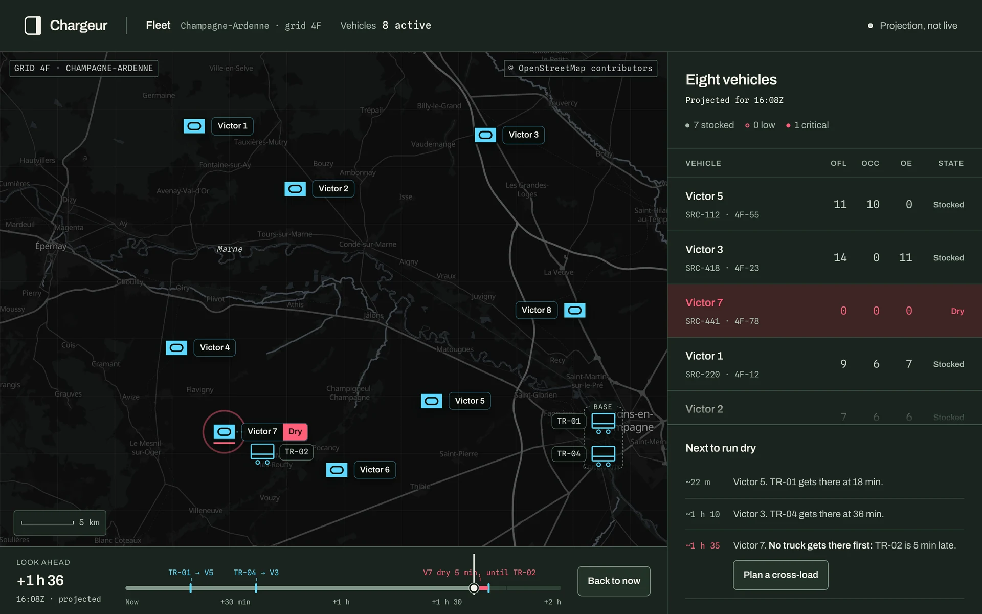
Drag the timeline and the map runs forward. Rounds fall at each vehicle’s rate of fire, and the trucks drive the queue as planned. The list and the markers follow, and the screen says plainly that it is a projection.
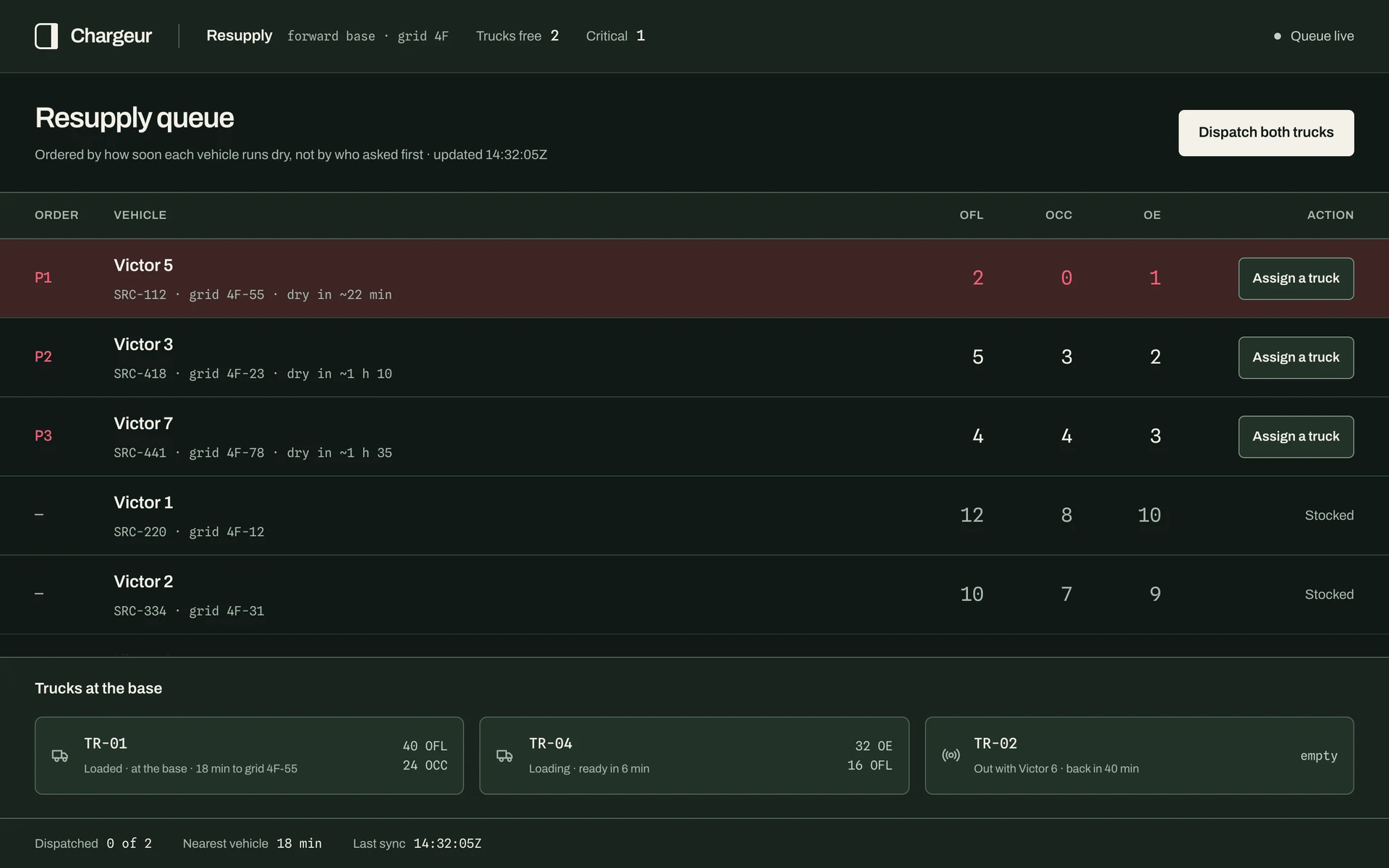
Victor 5 and Victor 3 are reached in time. Victor 7 is not: it runs dry five minutes before TR-02 gets there. Nothing on a live screen would show that for another hour and a half.
Is it always obvious when the screen is showing a projection rather than live state?
 View full size
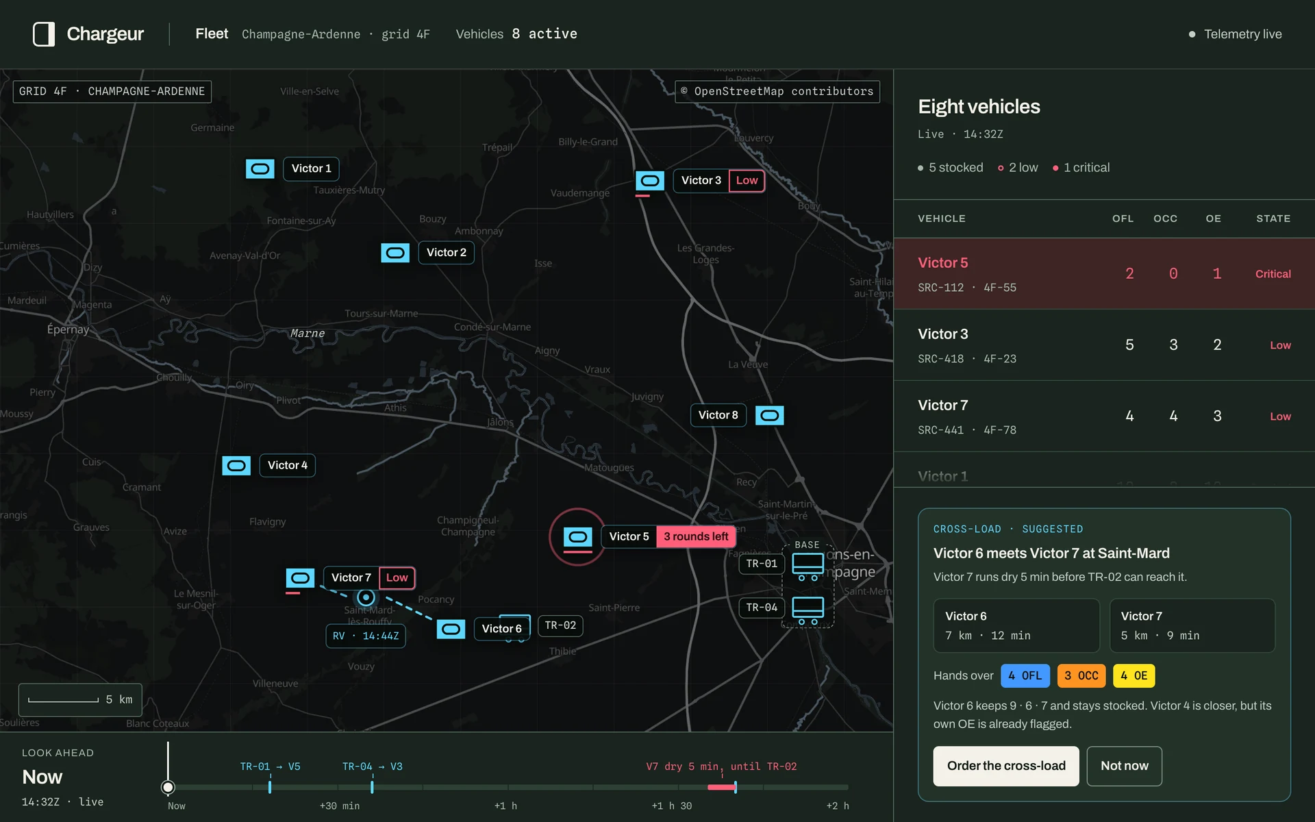
The gap gets a fix beside it. Chargeur suggests a vehicle with rounds to spare, a place to meet and what changes hands, and draws the plan on the map before anything moves.
Victor 4 is closer, but its own OE is already flagged. Victor 6 can hand over four OFL, three OCC and four OE and stay stocked. Order it, and the gap disappears from the timeline.
Does the suggestion say enough for a commander to trust it, or to overrule it?
 View full size
A table asks the same visual system to hold together at a much finer scale.
Type, spacing and boundaries give the table its repeated rhythm.
Do the smaller details receive the same care as the headline screen?
 View full size
A warm, dark foundation. Two purposeful typefaces. Colour only where someone has to decide something, and there it is strong. Each family is coloured by what the round is: blue for the tungsten dart, orange for the copper-lined shaped charge, yellow for high explosive, as NATO marks it. One alarm red belongs to no round.
#111916#F3F1E8#4298FF#FF9322#FFE31D#FF5E79A direct sans serif for headings, labels and body text. Scale and weight establish hierarchy before colour enters the picture.
Monospaced values make the information feel orderly. Numbers and short technical labels have a distinct, consistent voice.
Solid surfaces over glass effects. Defined edges over glows. Visible focus over hidden affordances. Enough space for both the content and the person reading it.
A few small studies make the visual intent tangible. Each choice also leaves something to be tested.
Type size and spacing create emphasis. Smaller text still needs enough weight and contrast.
Yellow, orange and red also step down in lightness, so they stay apart in grayscale and for colour-blind crews. In the carousel each family keeps its own primer mark.
Grouping can make related content feel connected. Generous spacing also reduces what fits on a screen.
The studies behind the finish. The right-hand column is what each choice is checked against.
These checks describe the interface as built. Each one says what it measures, and what it doesn’t.
Every text colour, including the three family hues and the alarm red, against each of the six interface surfaces it sits on. This checks colour pairs; it does not establish readability in every rendered situation.
All six views were checked at phone, tablet and desktop widths, from 390 to 1920 CSS pixels, with nothing overflowing.
Every button and row is 44 px or taller. The load plan’s tubes, packed edge to edge, give about 40 px each. Visible keyboard focus and reduced-motion styles throughout.
The most useful shift in this work was treating visual design as an act of care.
A stronger hierarchy. A label that doesn’t disappear. A little more space around something that needs attention. None of these details has to announce itself to make a difference.
Care also means doing the sums for someone: how far away the next round is, which layout keeps every family close, who runs dry before the truck arrives. Technical software can be composed and human without giving up any of its precision.