“Will it suit my face?”
Style, scale and fit are hard to judge from a flat product image. Without confidence, browsing becomes endless comparison.
Design response · recommendation in context01 Titan Eyeplus · E-commerce
Redesigning the journey from “will these suit me?” to a confident prescription purchase—for one of India’s largest eyewear retailers.
01 / Premise
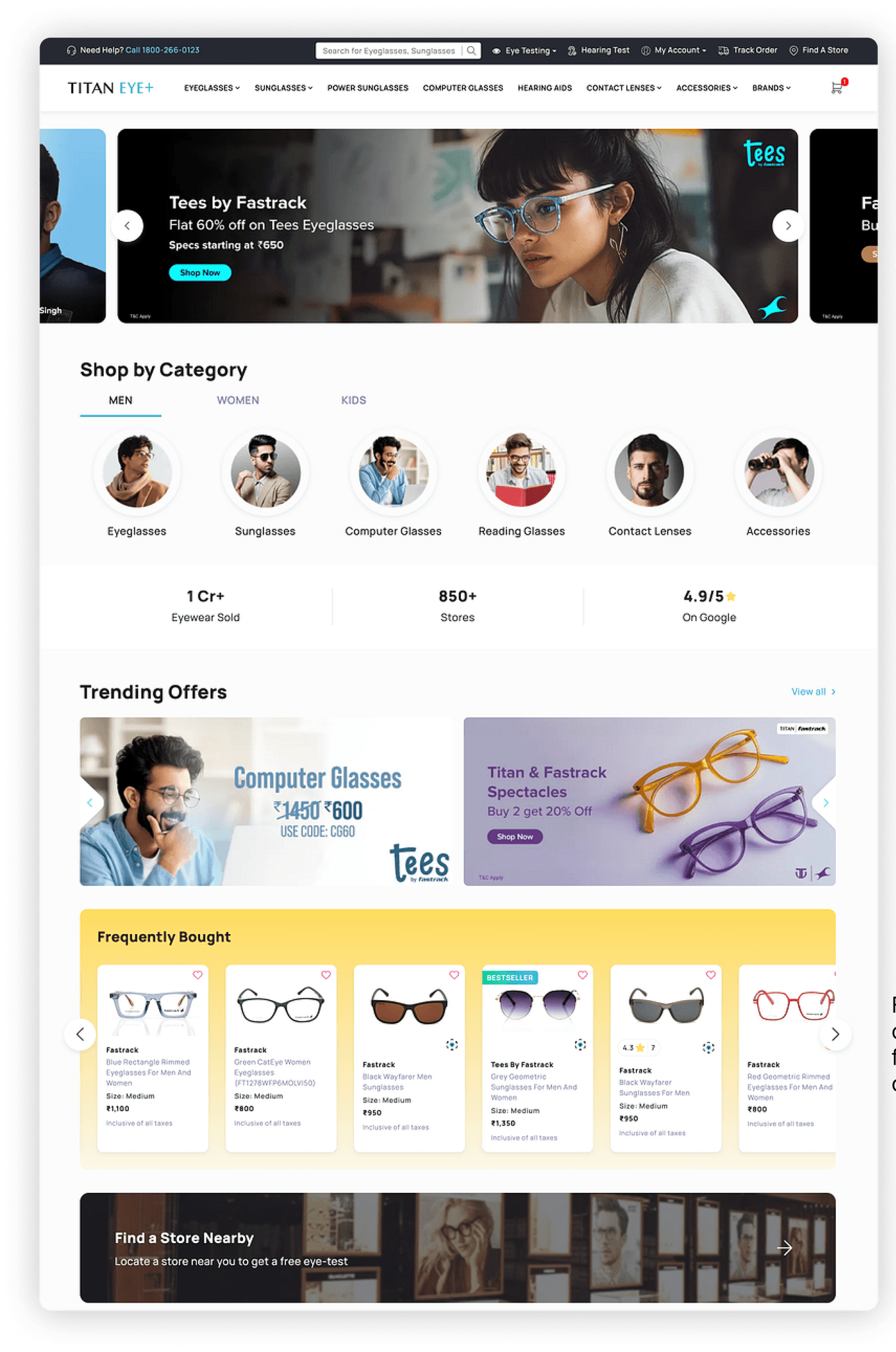
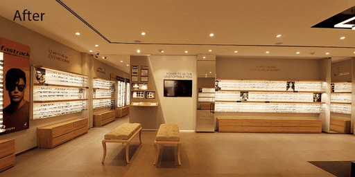
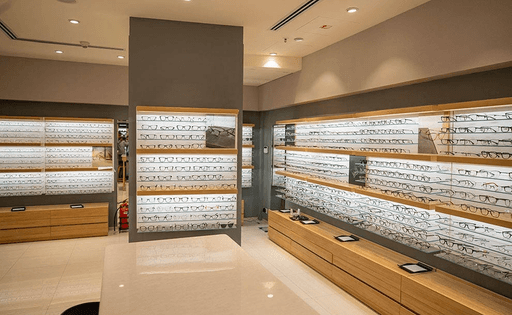
The stores already felt expert. The website made customers feel like they were shopping alone.
Titan Eyeplus had retail scale, trained optometrists and years of brand trust. Online, that advantage disappeared behind crowded promotions, brittle mobile flows and a purchase model that treated prescription eyewear like any other product.
02 / The disconnect
The design problem began before usability. Customers who knew the physical stores could not recognise the same care or authority online.
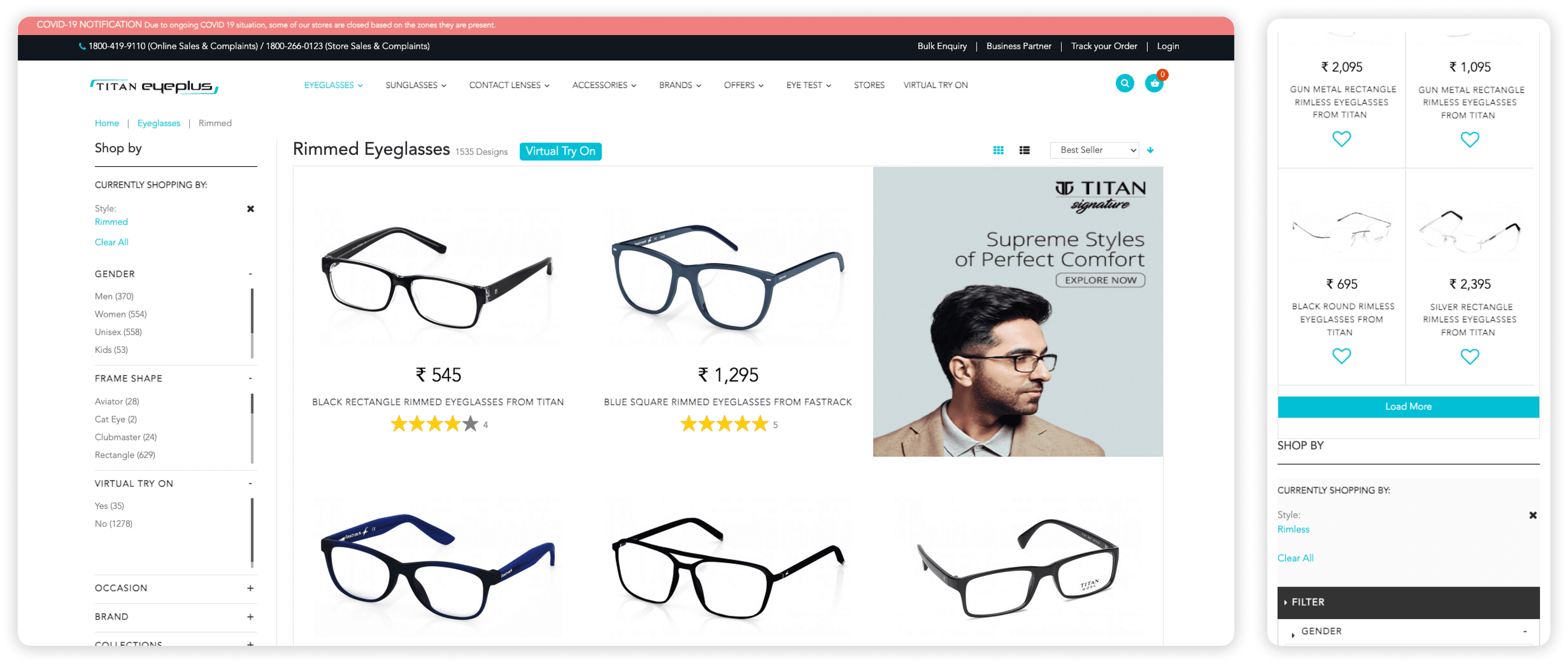
The inherited experience
Products, categories, promotions and virtual try-on competed at the same level. On mobile, the desktop catalogue compressed into an even noisier version of itself.
03 / Reframing the brief
Style, scale and fit are hard to judge from a flat product image. Without confidence, browsing becomes endless comparison.
Design response · recommendation in contextA medical detail sits inside a retail transaction. The flow needed the clarity of a form and the reassurance of an optometrist.
Design response · staged lens decisionsCoupons, loyalty points and lens costs appeared across separate steps. The total only became legible at the moment of commitment.
Design response · one visible billDesign thesisDo not reproduce the store on a screen. Reproduce the store’s ability to make the next decision feel safe.
04 / Research lens
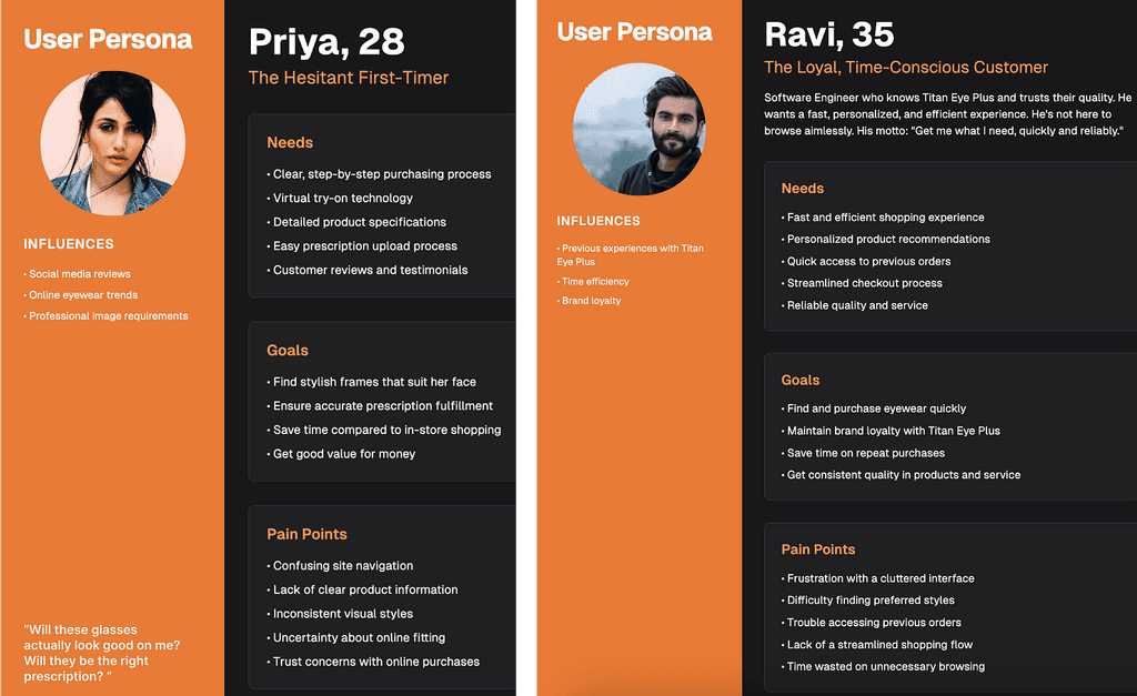
Research clustered around two recurring behaviours, not demographic personas. One shopper needed careful guidance; the other wanted the site to remember what they already knew.
Needs fit explanation, prescription reassurance and visible returns before committing.
Needs remembered preferences, efficient filters and a short route back to a trusted frame.
05 / Journey architecture
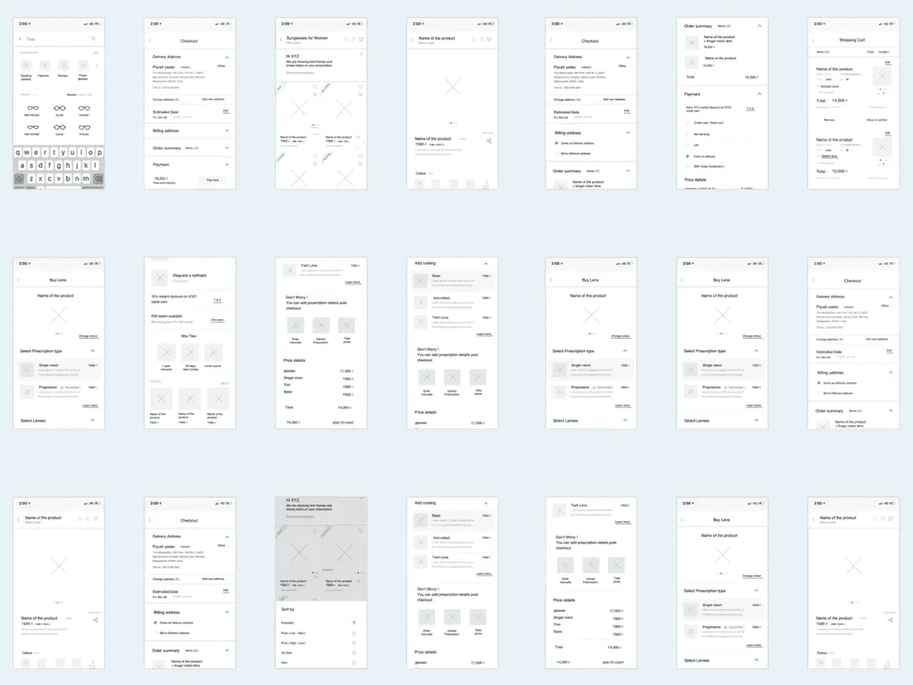
Browse by recognisable category and intent.
Filter without losing the product field.
Make fit, dimensions and delivery concrete.
Clarify lenses, benefits and final price.
06 / Orient
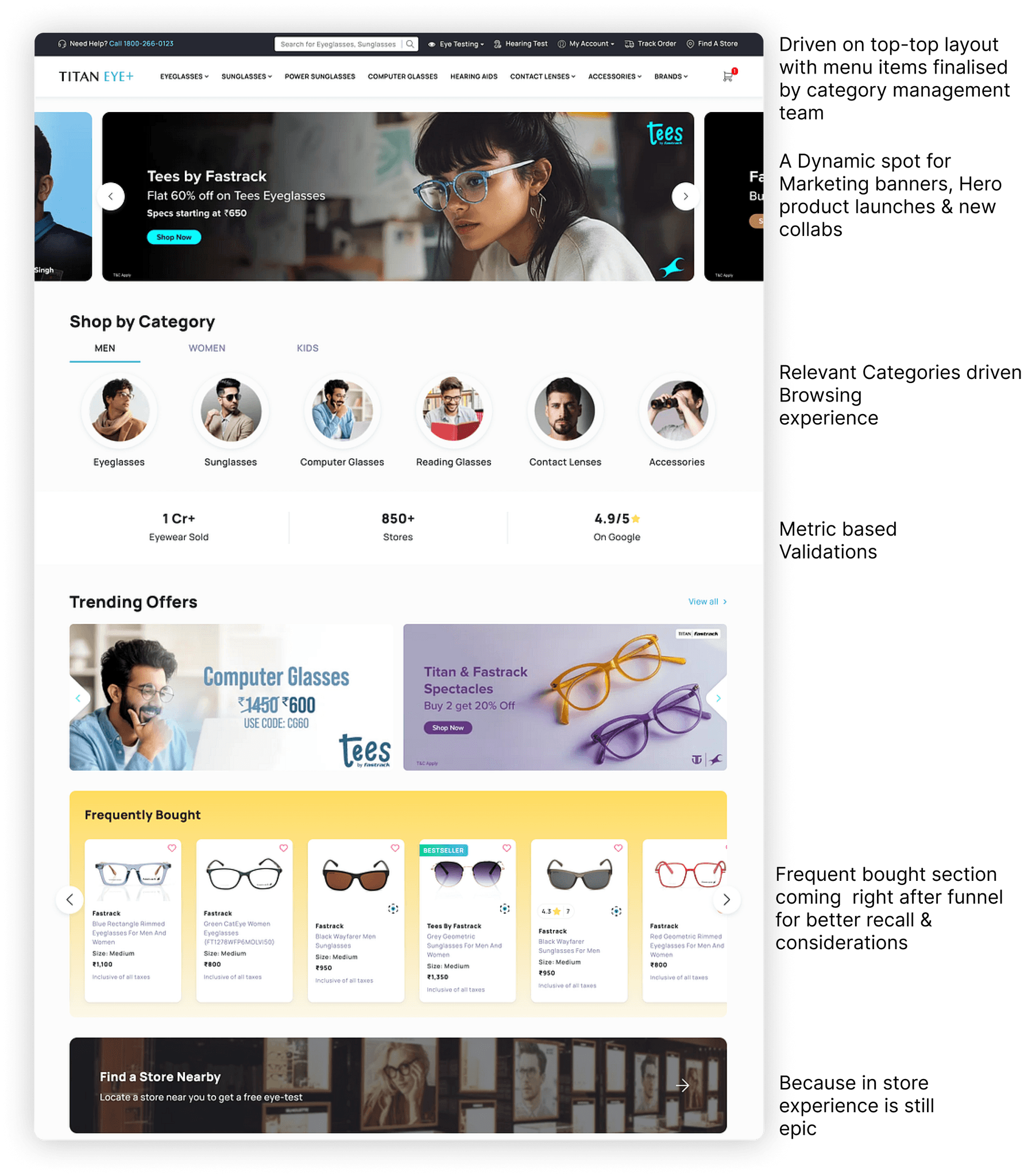
We moved from a wall of campaigns to a category-first browsing model. Marketing still had room to move, but the customer’s route into the catalogue no longer depended on reading a banner.
07 / Narrow
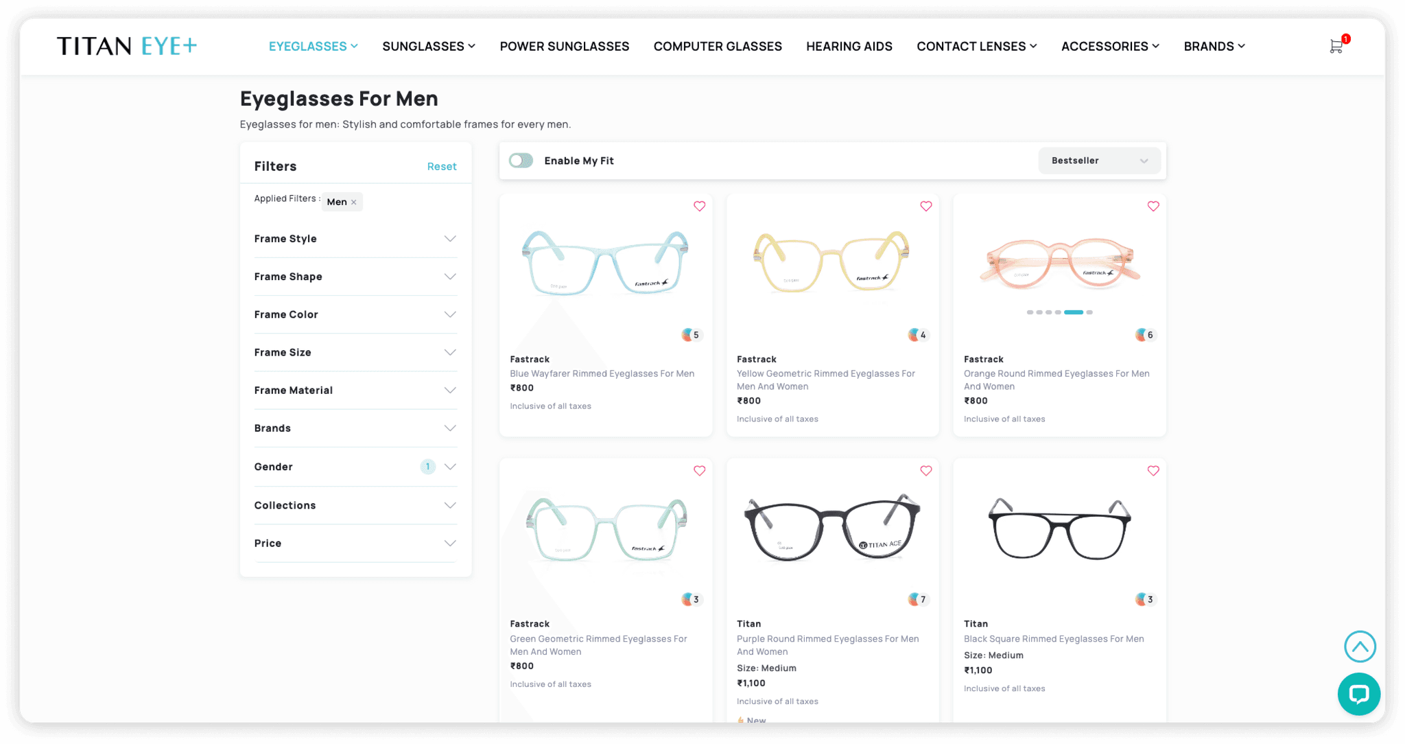
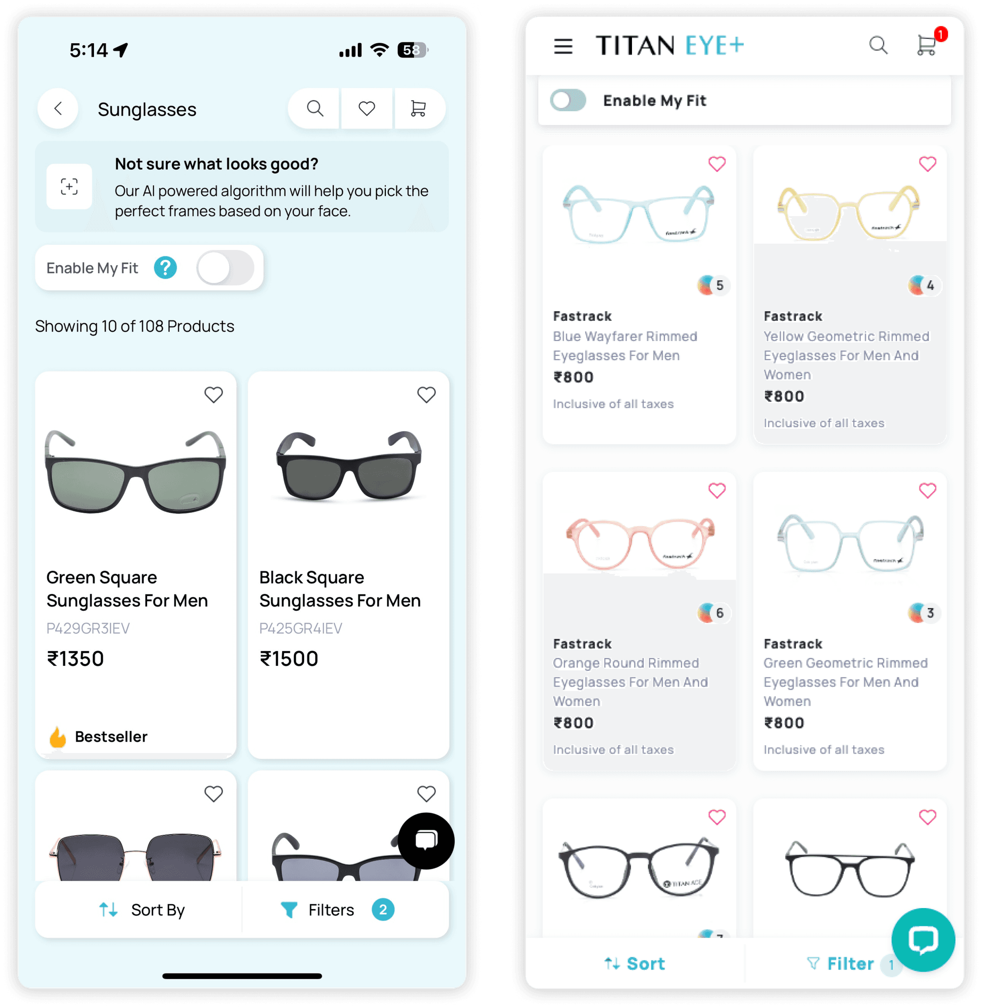
A catalogue this large needs structure without making shoppers define themselves too early. Persistent filters support deliberate search; “My Fit” offers a softer layer for people who know the feeling they want, not the terminology.
Feature move / My Fit
Instead of sending shoppers into a separate quiz or camera flow, the recommendation layer lives directly inside the catalogue. Turn it on, keep browsing, and preserve every familiar control.
Leave the catalogue → complete a flow → start over
Express intent → narrow the same catalogue → stay oriented
08 / Judge
The product page was reorganised around fit confidence: what the frame looks like, how large it is, whether it supports the customer’s lenses, when it will arrive and what happens if it is wrong.
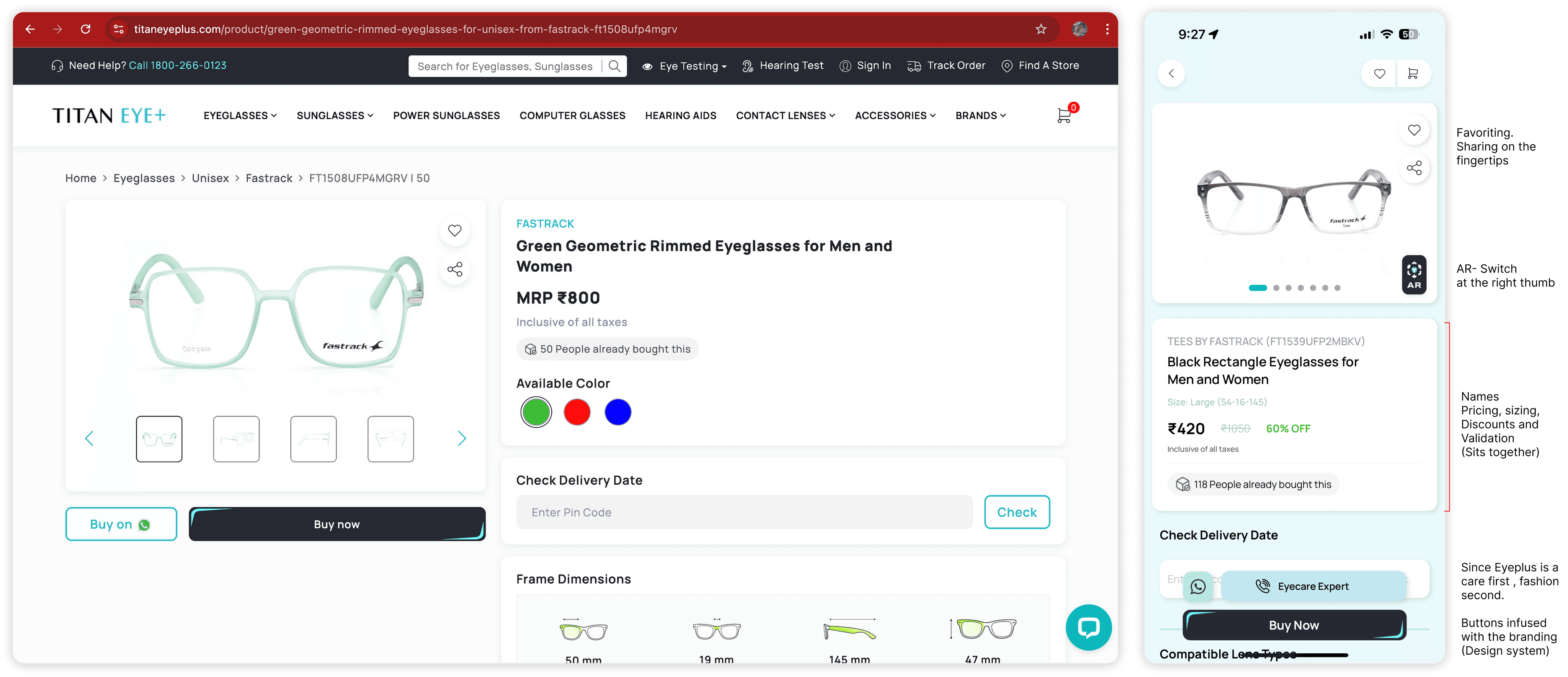
Bridge, temple and lens width replace the ambiguity of “medium.”
Delivery and expert help stay adjacent to the buying decision.
The primary purchase control persists on narrow screens without hiding the product context.
09 / Commit
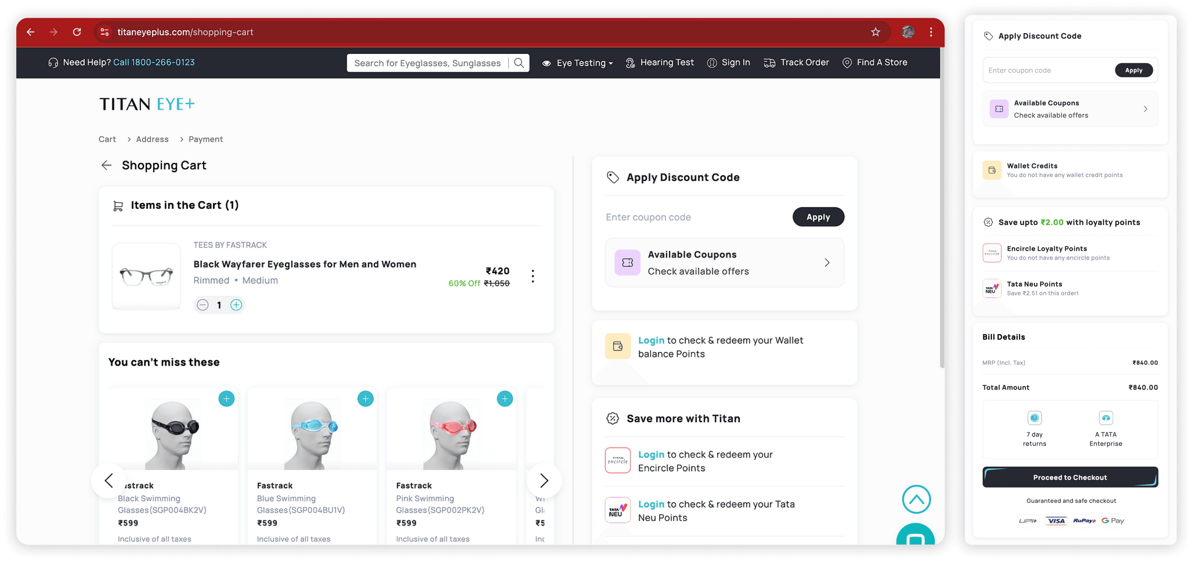
The old journey distributed discounts across three separate dialogs. We brought coupons, Encircle points, Tata Neu rewards and the itemised bill into one visible decision surface.
10 / Post-launch signals
Reported across the first 90 days after launch using e-commerce analytics and internal order data.
The before/after values use the same definition on both sides. Percentage points are kept separate from relative percentage change.
11 / Reflection
Eyewear showed us that e-commerce is not always a funnel problem. When the product is personal, medical and aesthetic at once, progress comes from resolving uncertainty in the right order.
The most durable design move was not a new feature. It was deciding what each screen needed to make true before asking the customer to continue.