Value
Which capabilities would matter enough to survive beyond the first week of novelty?
01 Titan Eye+ · Smart wearable
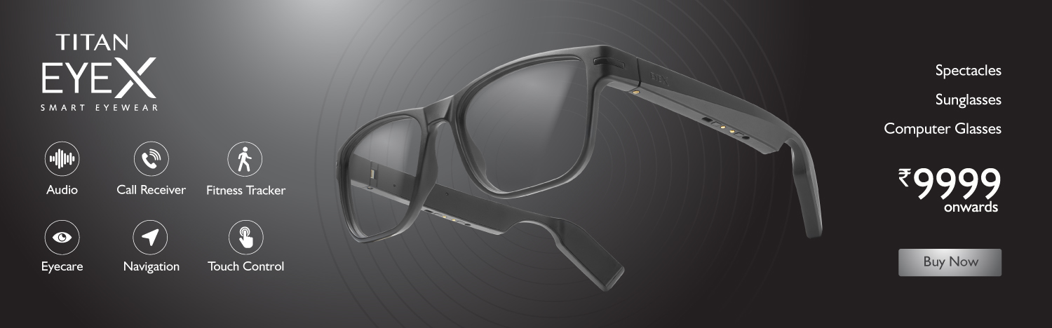
Designing the product experience for EyeX—smart glasses that play music, take calls, track movement and care for your eyes, without looking like a gadget.
The brief sounded like an app. The real design problem lived across three surfaces: the glasses, the phone and the world around the wearer.
EyeX used open-ear audio so people could stay connected without losing awareness of their surroundings. That made the experience safer and more social—but also created a new mental model. People understood “glasses” and “earphones.” They did not yet understand the space between them.
02 / The object
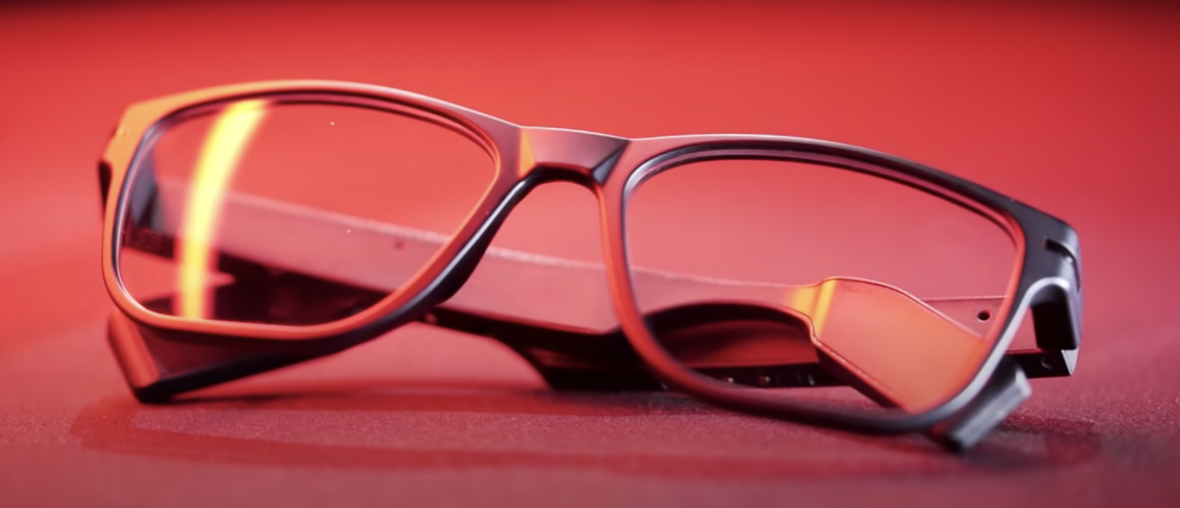
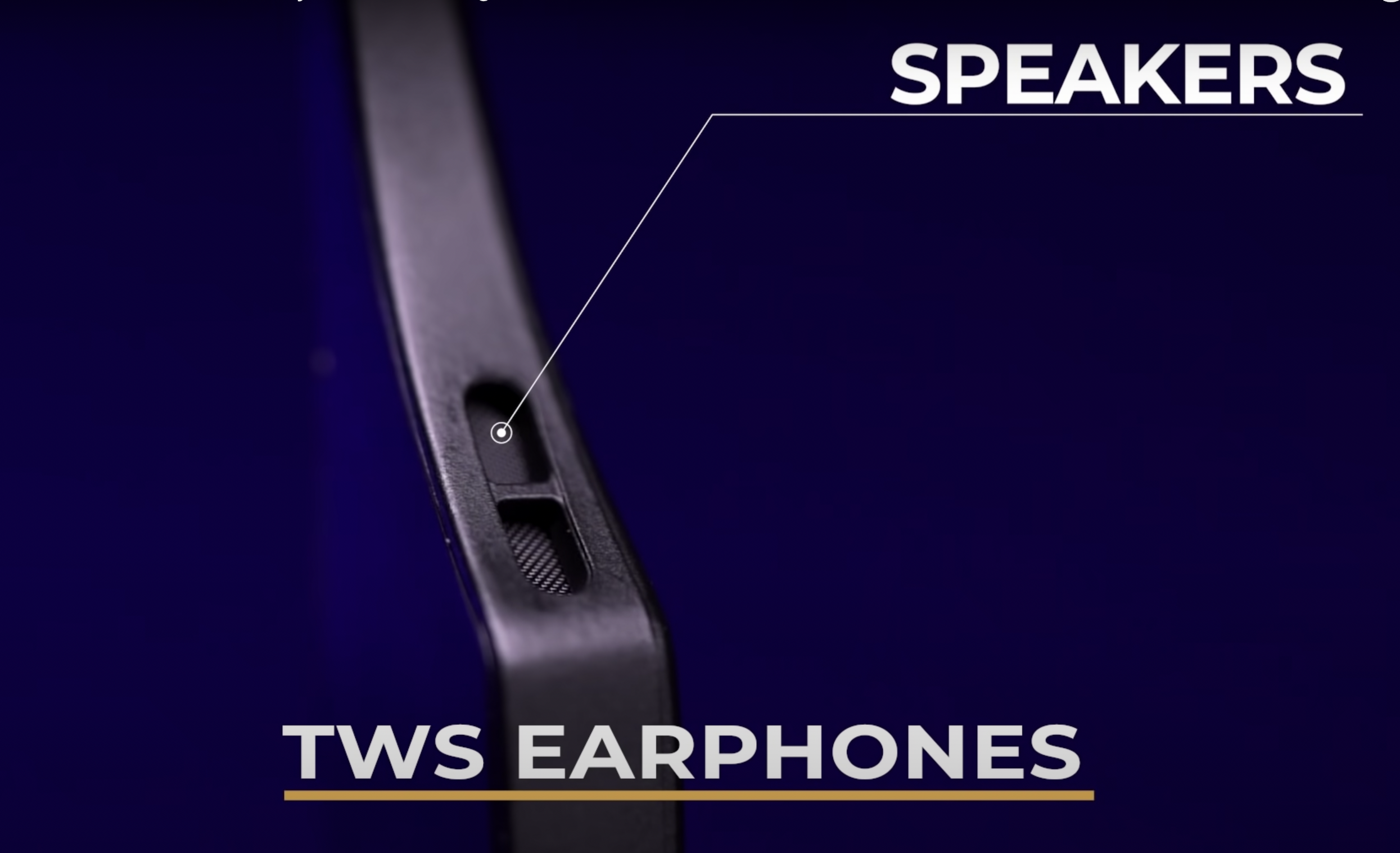
The hardware was deliberately quiet: a 28-gram everyday frame hiding open-ear speakers, dual microphones, touch controls, Bluetooth and motion sensing inside its temples.
Campaign film / Launch
Before explaining flows, we let the object establish desire. The launch film shows the frame in its intended register: familiar eyewear first, invisible technology second.
Watch with sound ↗03 / Reframing the brief
Which capabilities would matter enough to survive beyond the first week of novelty?
How could unfamiliar gestures and two separate batteries feel obvious, not technical?
How should the app, physical frame and existing Titan Eye+ ecosystem behave as one?
04 / Research
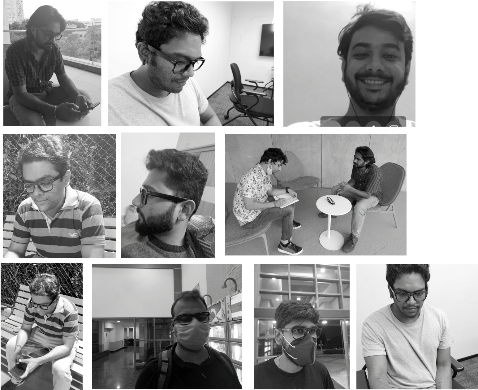
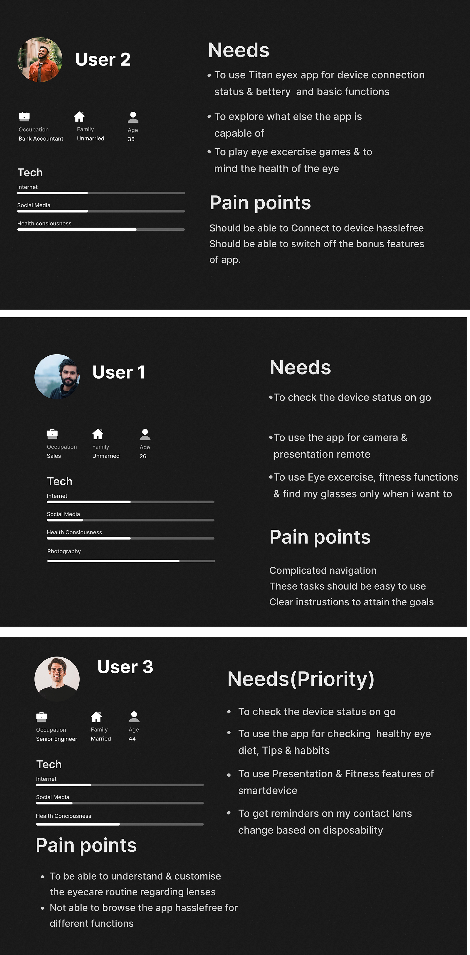
Interviews spanned spectacle wearers, non-wearers and people already comfortable with smart accessories. We tested value before polishing screens.
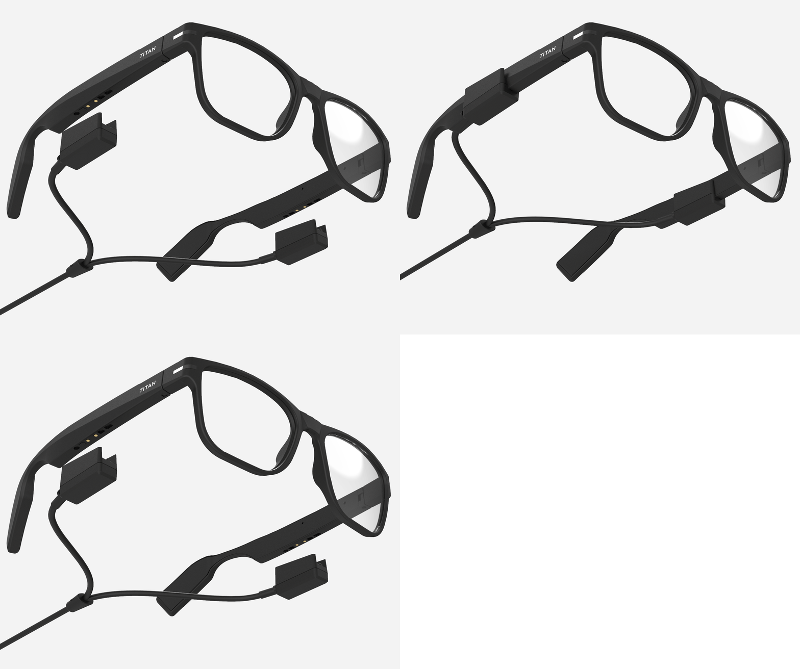
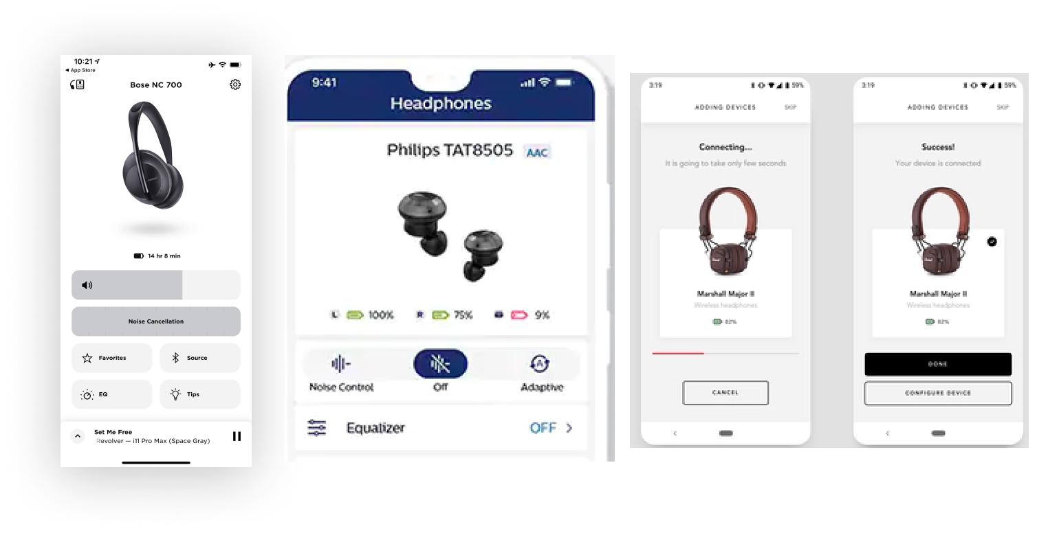
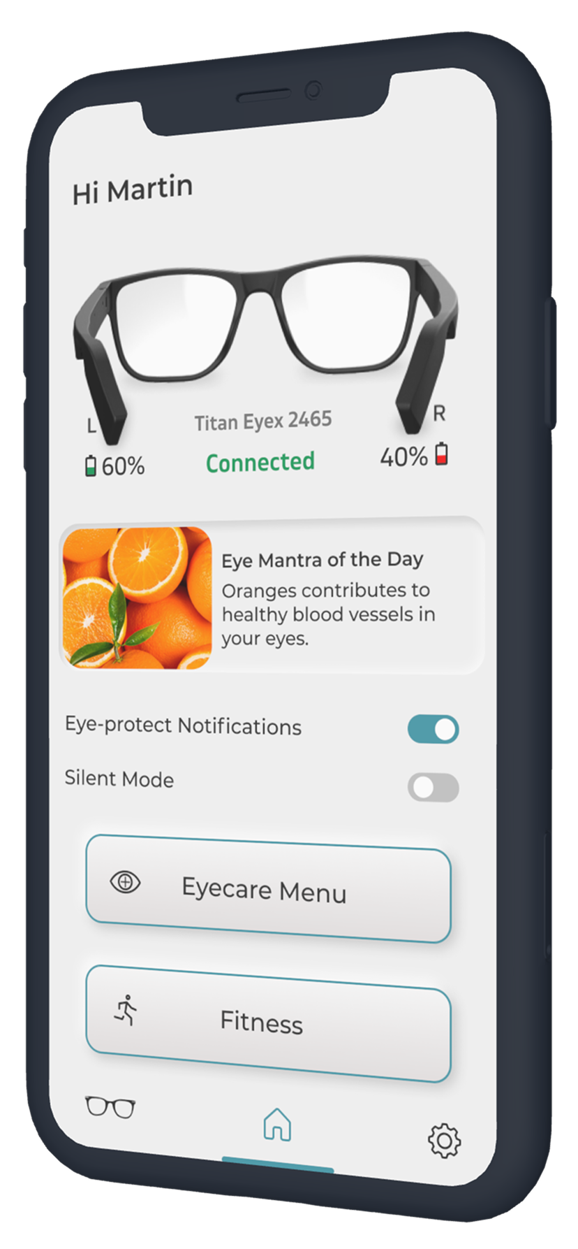
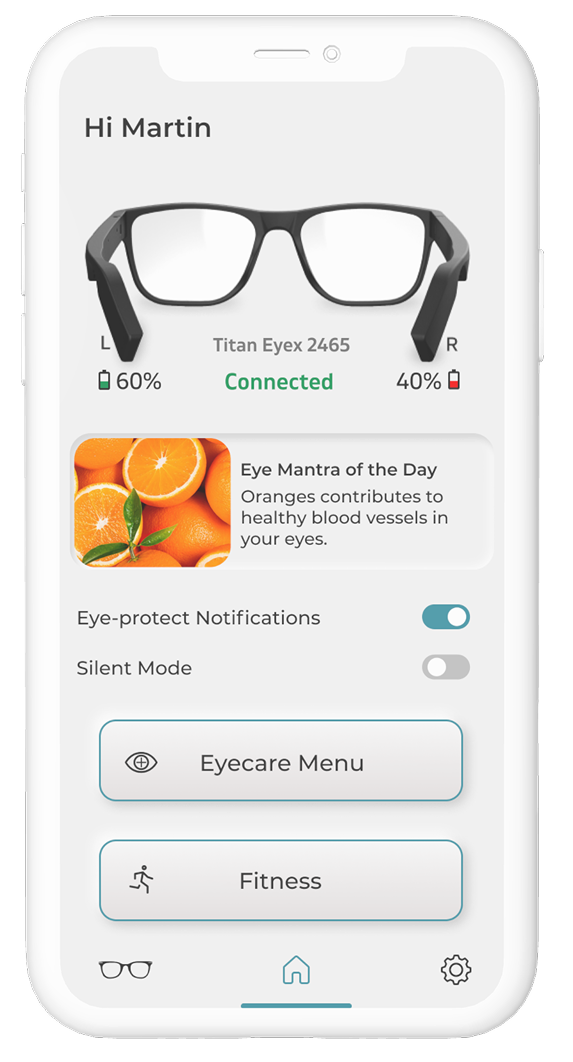
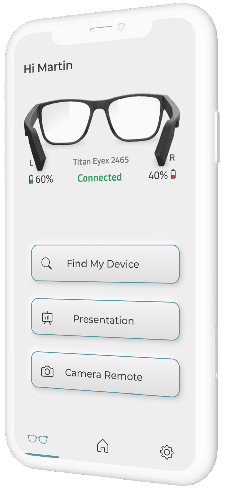
Device and battery status were not utility details; they were the foundation of trust. The two temples could discharge independently, so the home screen had to explain both at a glance.
People wanted calls, music and navigation because they reduced phone use. Secondary tools had to remain voluntary and quiet.
Users valued guided assessments and healthy-screen reminders more than our early assumptions predicted. It connected the technology back to Titan Eye+’s reason to exist.
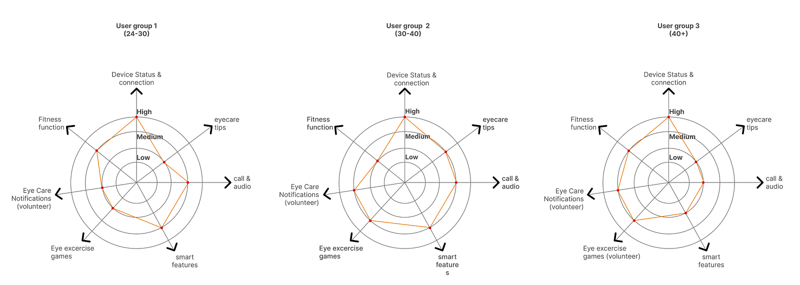
We spoke with spectacle wearers, non-wearers and smart-accessory users across three age bands. Their appetite for bonus features changed; their need for a dependable connection state did not.
Camera, fitness and remote tools made the frame feel worth discovering.
Connection, eye-care controls and useful extras had to coexist without clutter.
Readable setup, lens reminders and clear status mattered before novelty.
04B / In the room
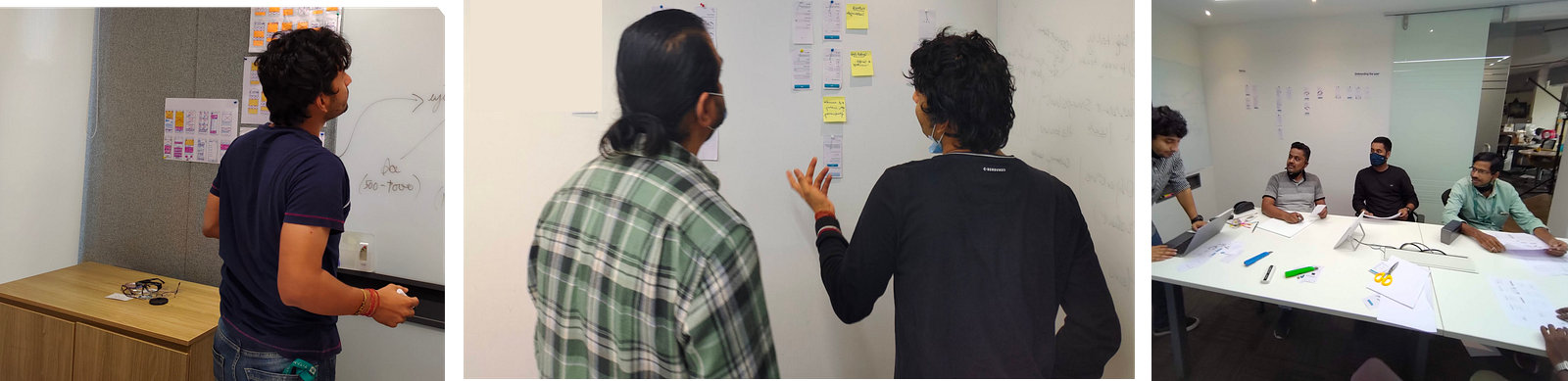
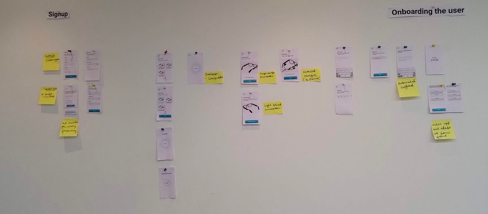
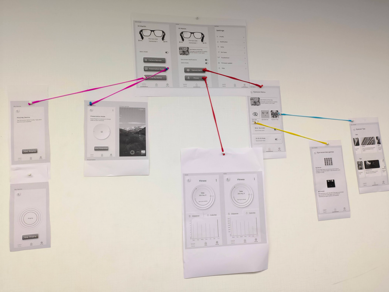
Research became useful only when the team could challenge it together. We pinned competing flows, walked every state, argued about priority and kept the unresolved parts visible.
05 / Experience architecture
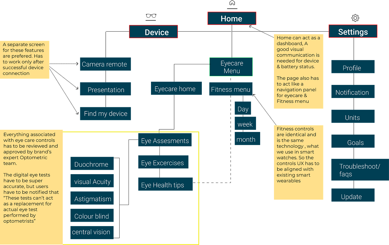
The information architecture went through eight passes. The final model separates what belongs on the frame, what belongs in the companion app and what should disappear into the background.
06 / The design pivot
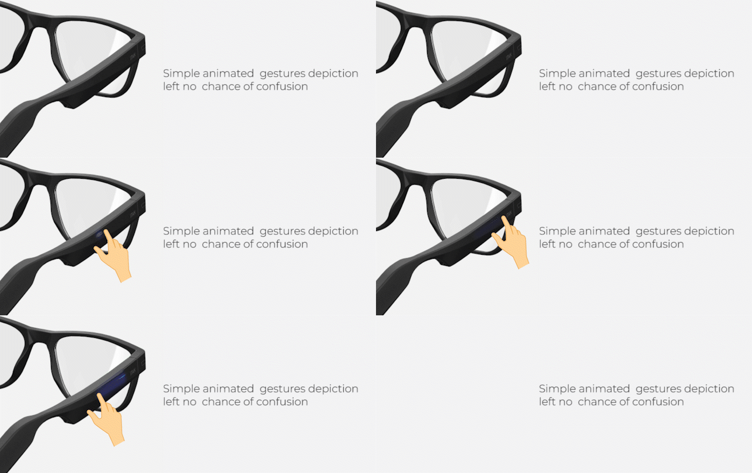
Early onboarding used friendly illustrations. Tests showed that friendliness was not clarity: people still could not tell which temple to touch, which way to swipe or what feedback to expect.
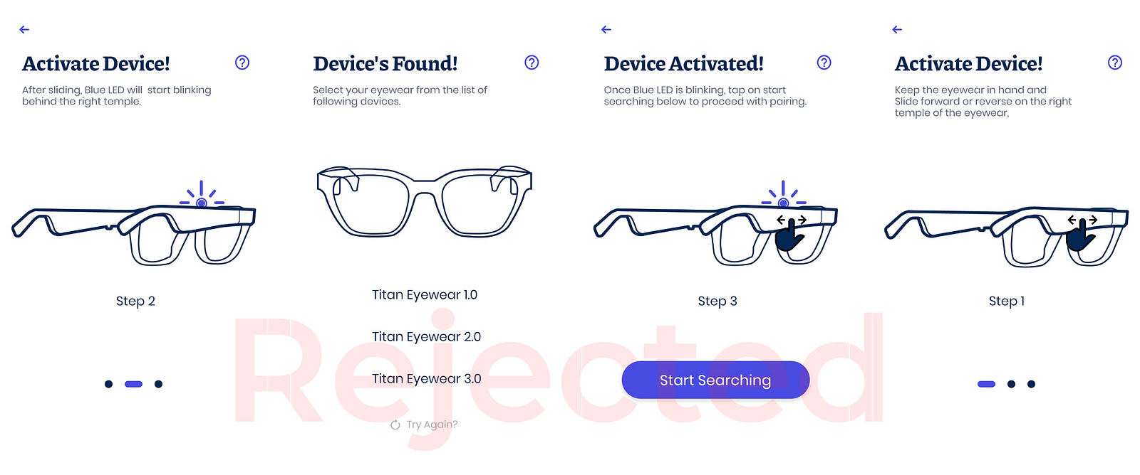
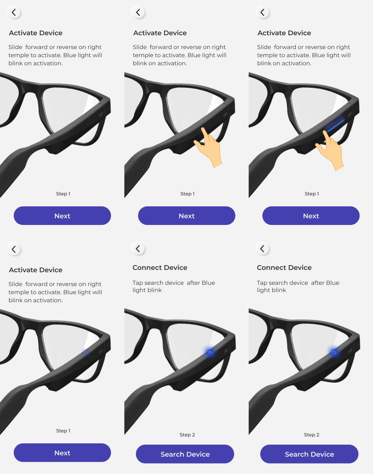
We modelled the glasses in Cinema 4D, rendered them in KeyShot, animated gestures in After Effects, then shipped them as lightweight Lottie sequences. Each instruction showed the exact object, action and response.
07 / Final experience
The final product is presented as six behavioural stories—not a wall of UI. Each sequence answers a different question the wearer has, from “is it connected?” to “what can my glasses do now?”
01 / First run
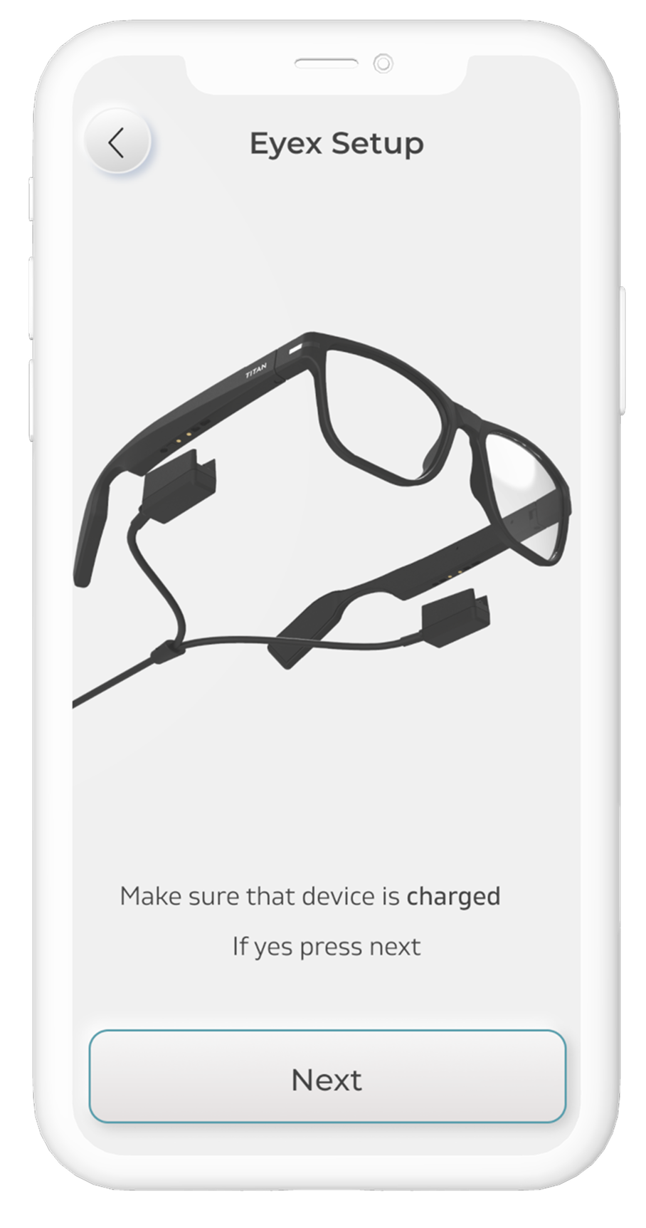
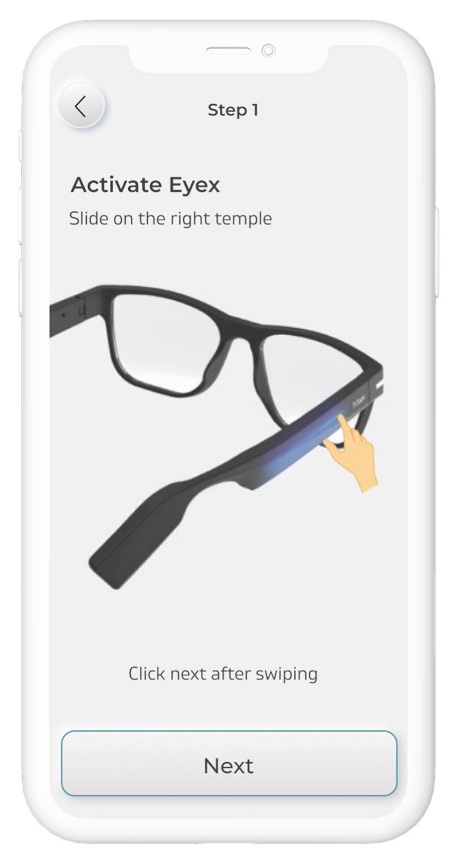
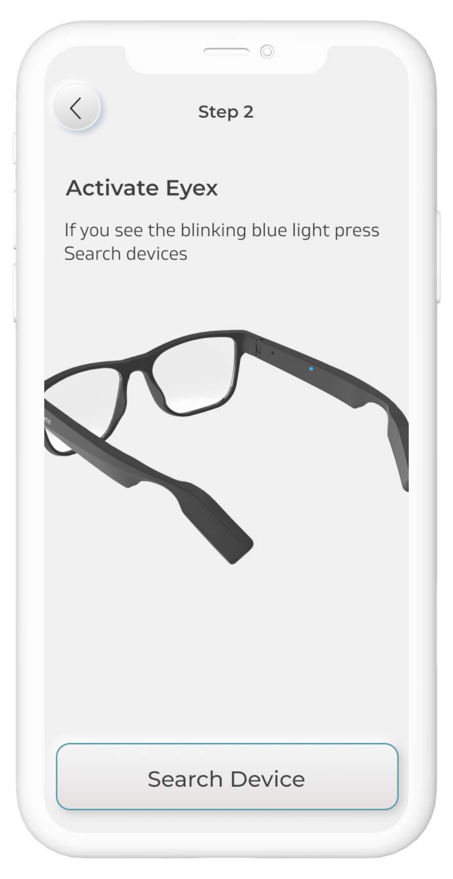
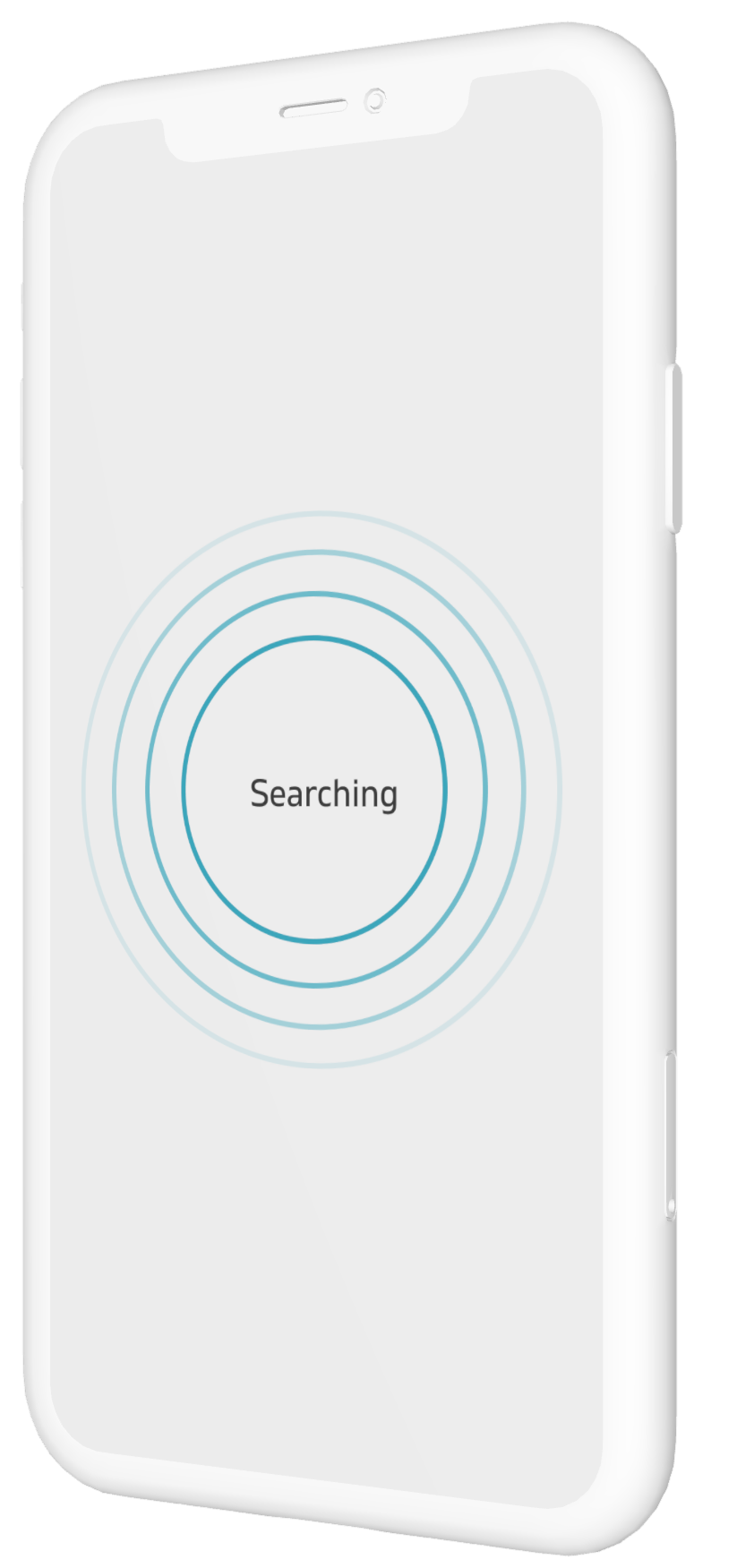
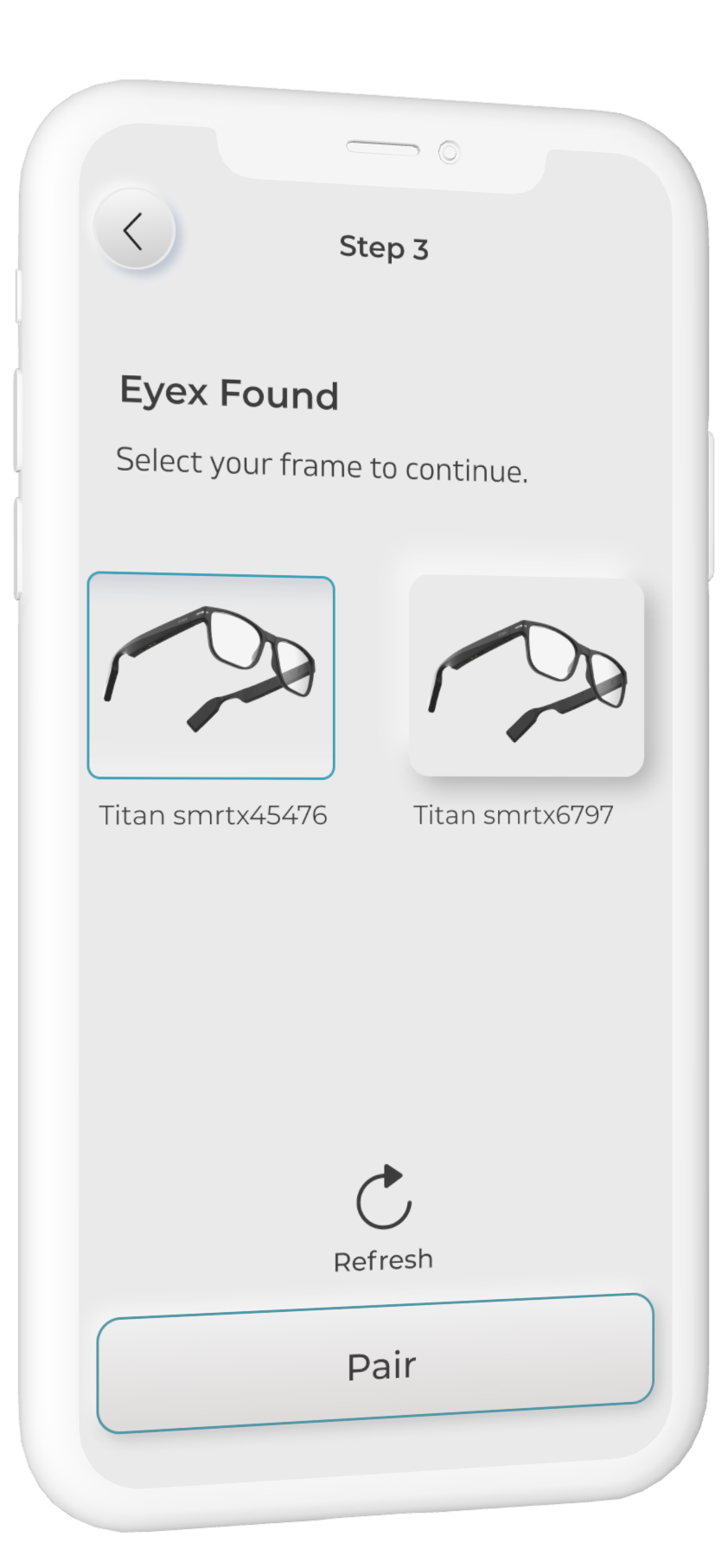
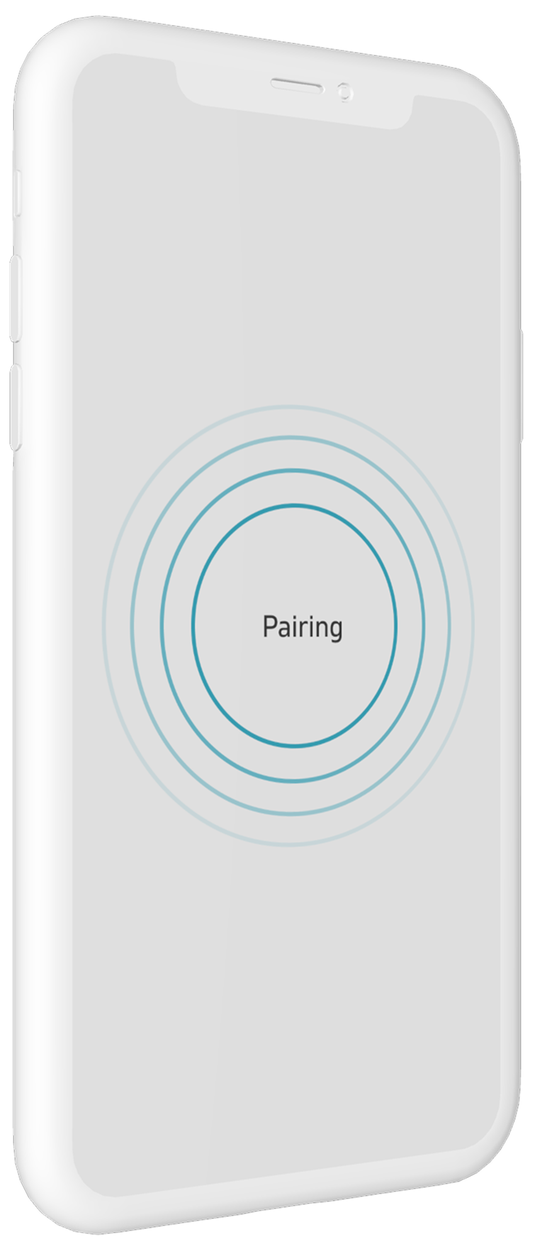
Account inputs stay short. The real onboarding begins when the frame appears: charge it, wake it, open the temples, then search. Each screen names one physical action and waits for one observable response.

02 / Pair & status
Connection and battery are not utility details; they are the product’s trust contract. The dashboard gives the frame the top of the hierarchy and reports both temples independently.
03 / Eye care
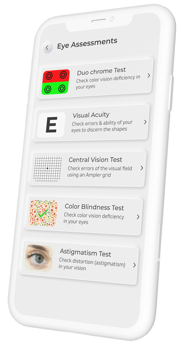
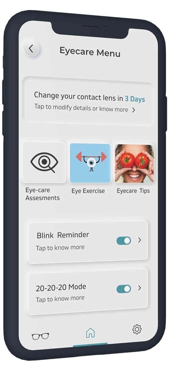
Eye care was the credible advantage competitors could not copy. Five guided checks sit beside contact-lens, blink and 20–20–20 reminders—with every prompt voluntary and reversible.
04 / Fitness
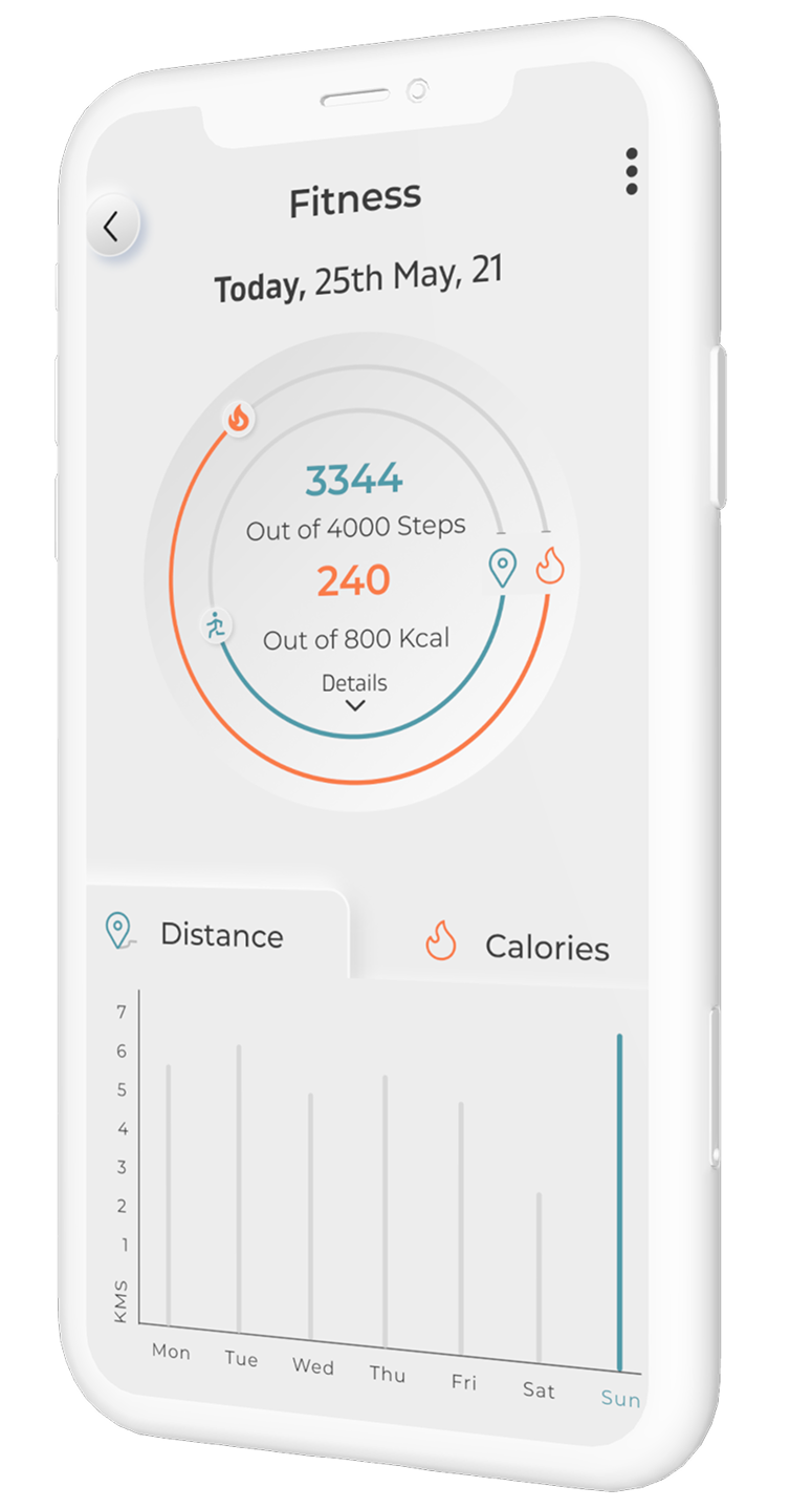
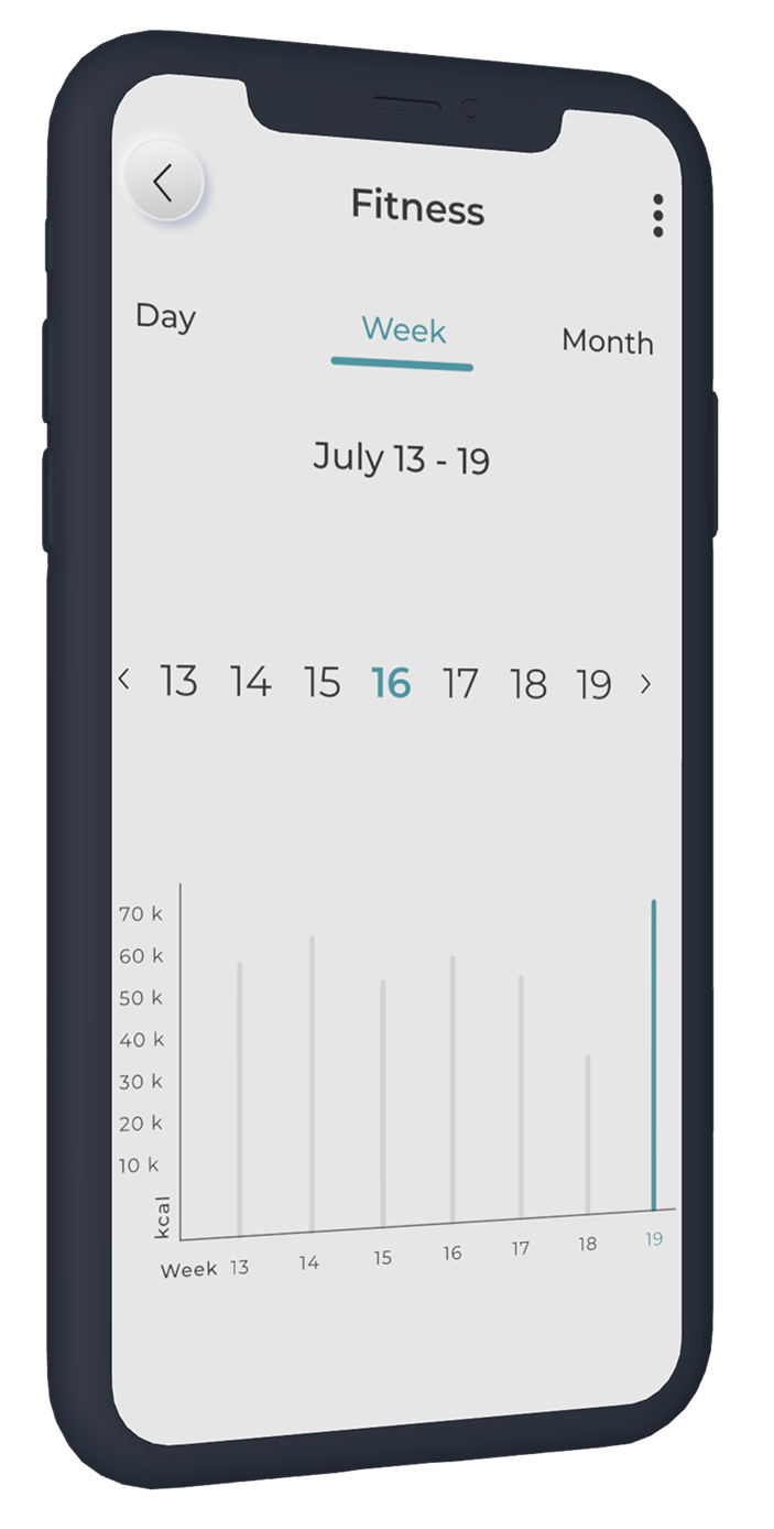
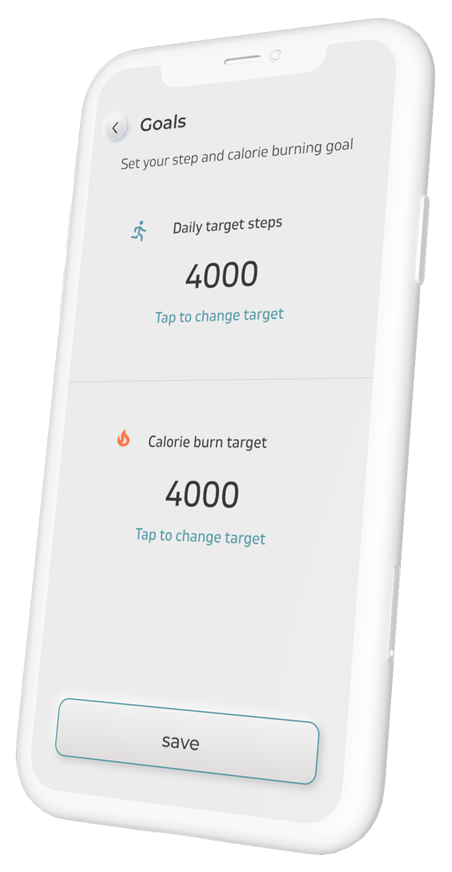
The motion sensor reads head movement, but the interface never asks people to learn a new fitness language. Rings, goals and day/week views make an unusual sensor feel immediately legible.
05 / Remote tools
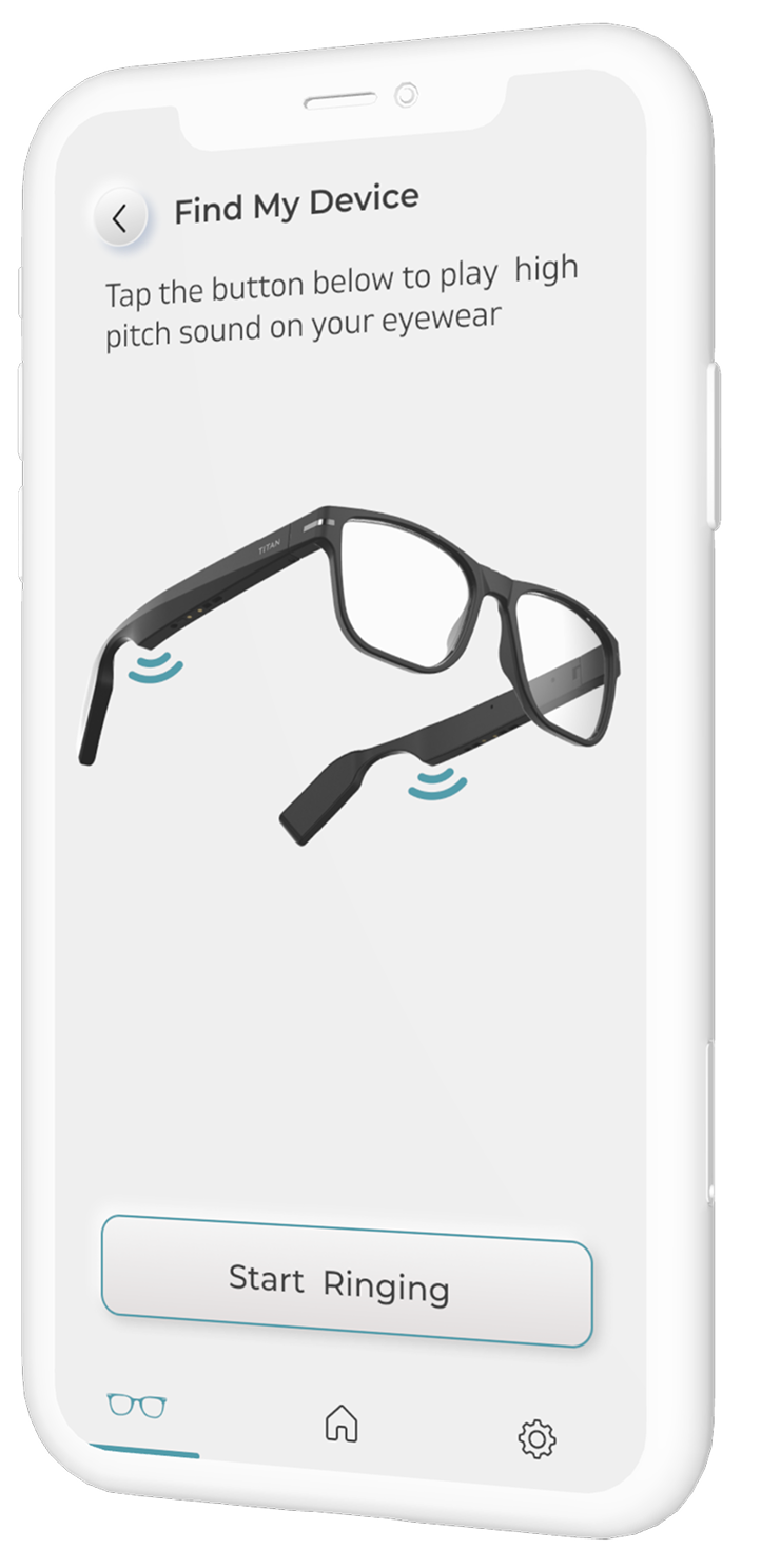
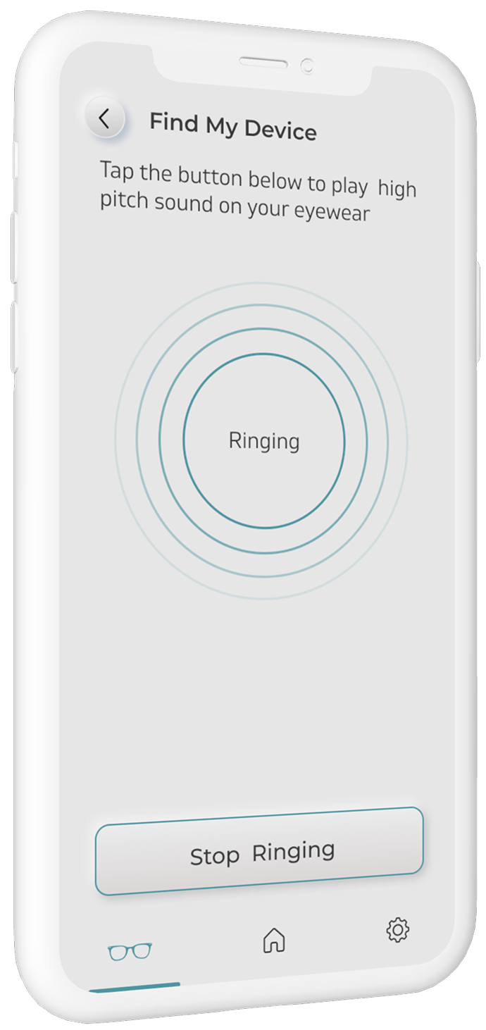
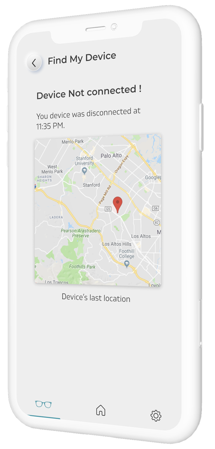
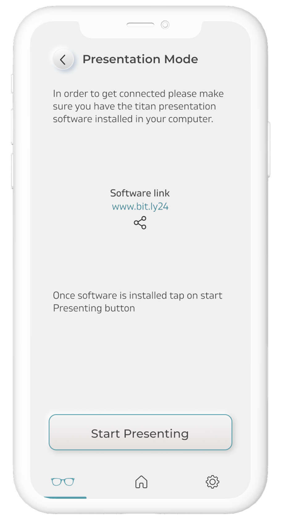
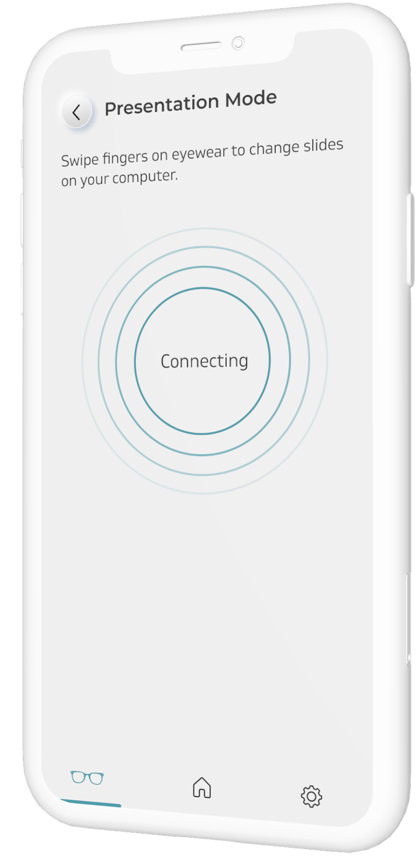
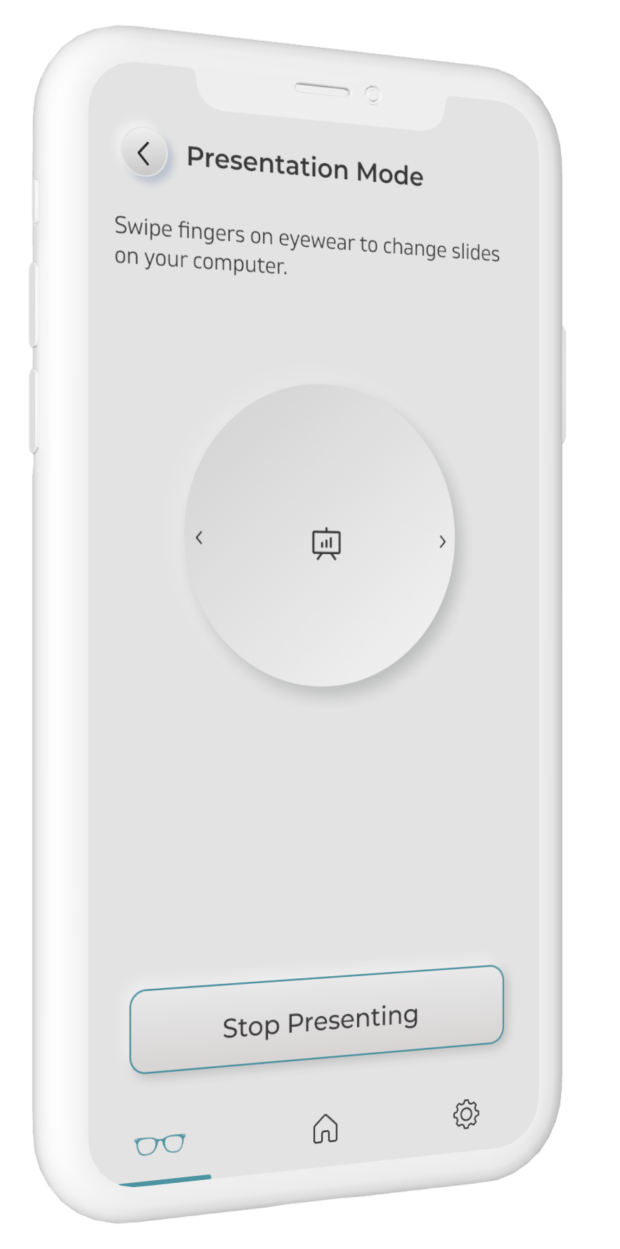
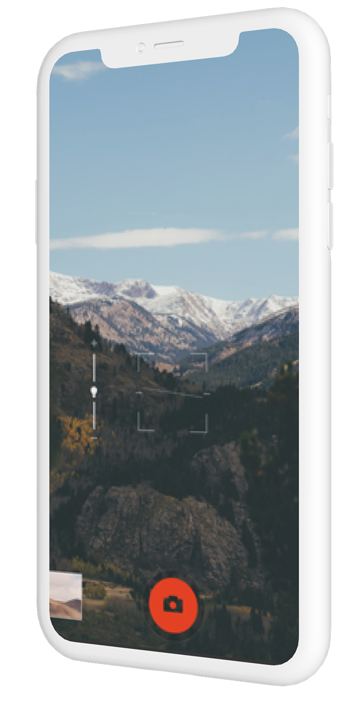
A temple gesture becomes a camera shutter or presentation control. Recovery is designed for both kinds of failure: ring nearby glasses, or use the last known location once they disconnect.
06 / System depth
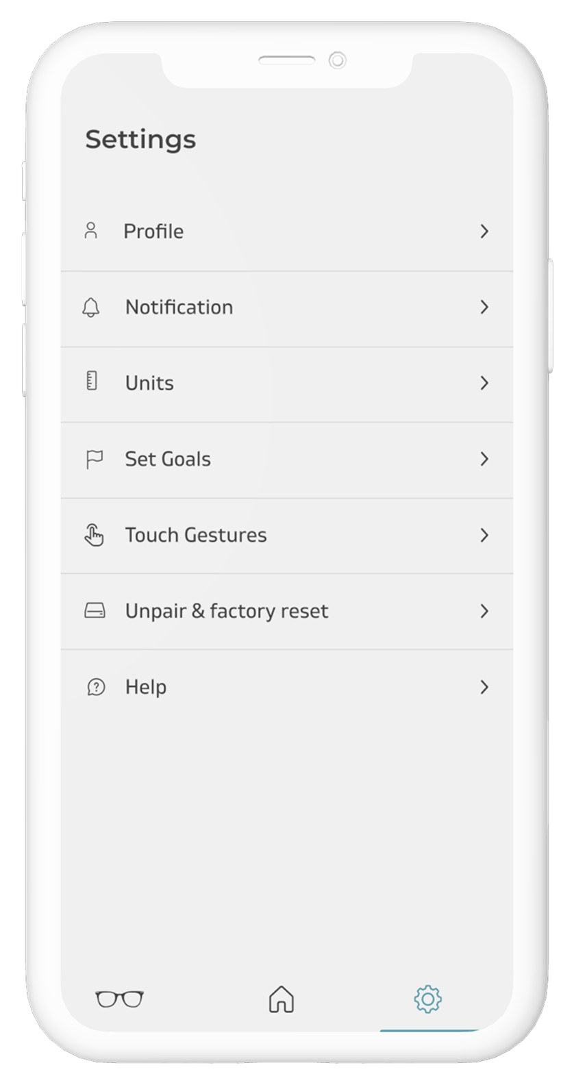
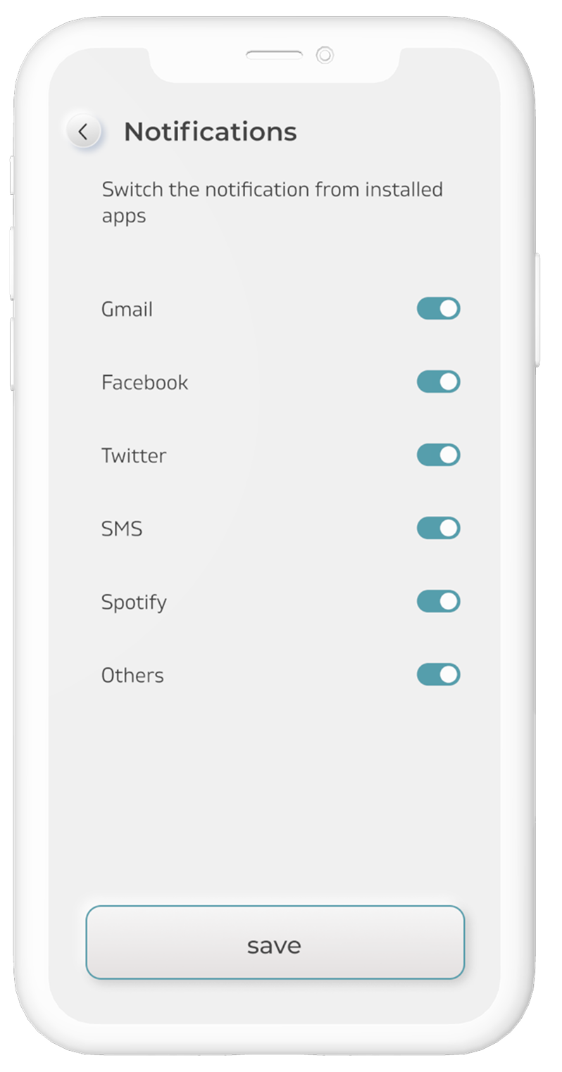
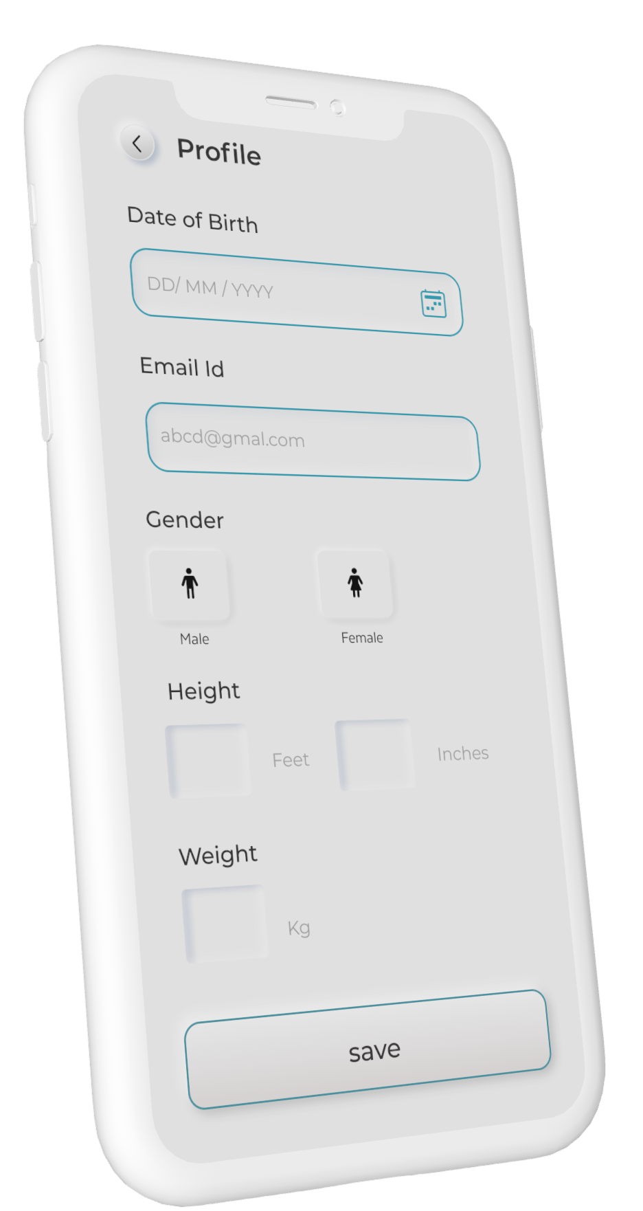
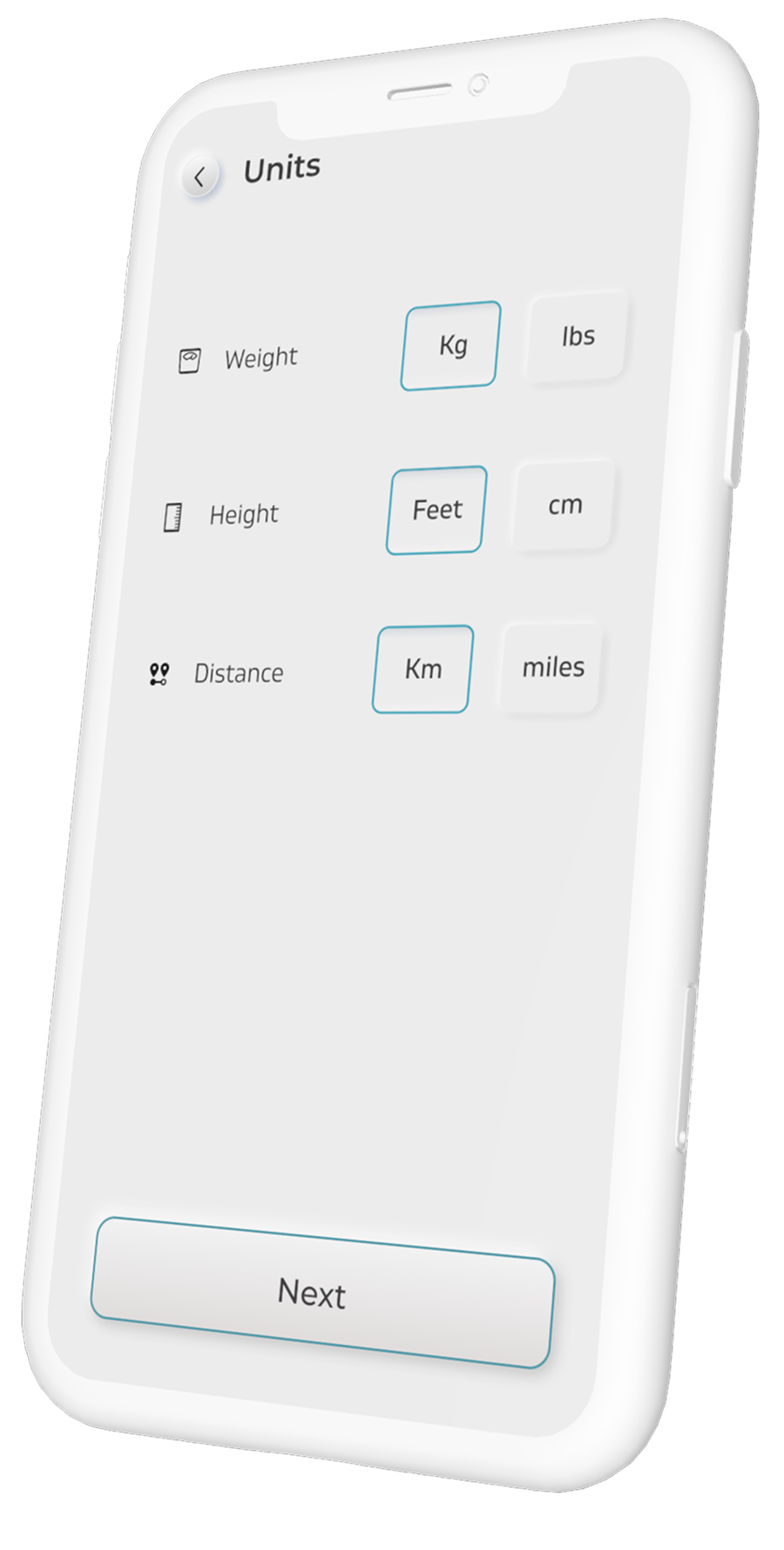
Notifications, profile inputs and local units are not launch moments. They are what make fitness, reminders and cross-device behaviour dependable—and every optional behaviour remains editable.
08 / Interaction language
09 / Outcome

10 / Looking back
Our early instinct was to give exciting interactions—music, fitness, camera control—the loudest voice. Research corrected that. People became curious only after they felt oriented.
The strongest work was not one screen. It was the connective tissue: honest device states, literal gesture teaching, voluntary wellbeing tools and a visual language built from the object itself.
Make the unfamiliar legible.
Then let the magic happen.