Consulting engagement under NDA, delivered with a partner agency. The client and program names have been withheld or altered; the process and outcomes are real.
Case 02 / Counter-UAS operations · 2023 · Under NDA

One airspace.
One decision surface.

PRAHARI unifies RF, radar and optical contacts for a counter-drone operations team. We designed the decision surface that lets a duty officer understand a contact, choose a response and leave an audit trail without stitching three systems together over radio.

Design partner Desktop C2 Interface Military & Defense
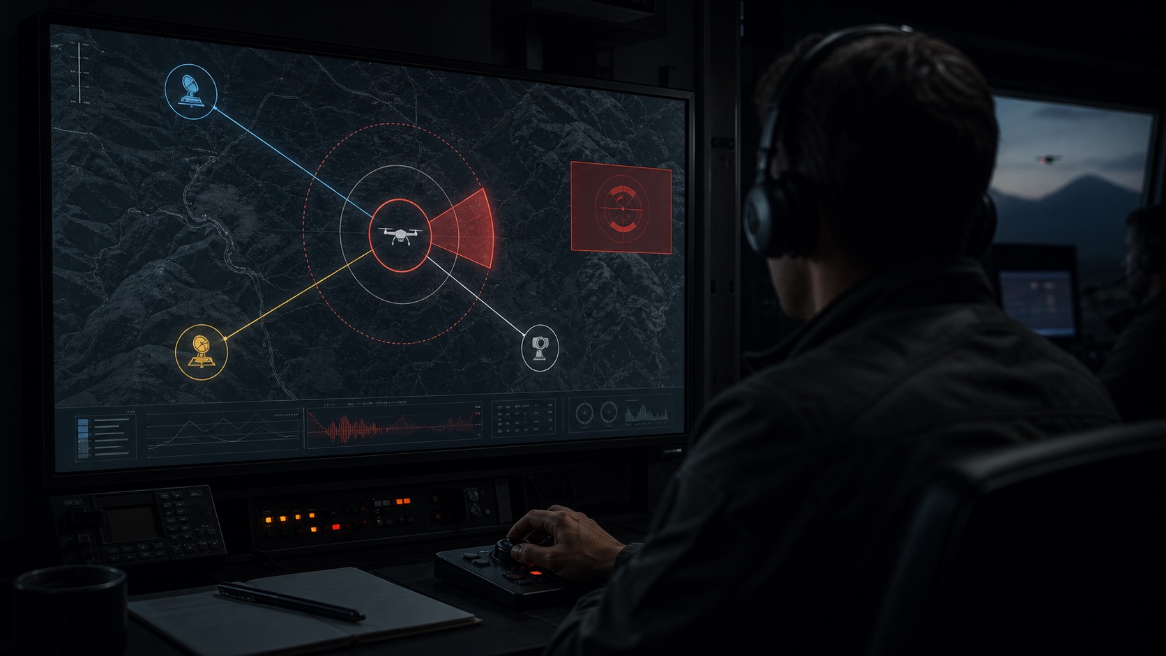
Duty officer monitoring a fused counter-drone contact picture in a dark operations room
Reconstructed operational context · RF, radar and optical evidence brought onto one decision surface
< 4 minutes Shift handover, down from 18–35 minutes
≤ 3 interactions From contact review to response
100% logged Every engagement action captured automatically
Case in one line
The operational gap was not sensor coverage; it was correlation. PRAHARI turns three feeds, three people and a verbal handoff into one spatial picture with explicit confidence, action state and accountability. 7 minute read · Product + systems design

On 27 June 2021, two improvised drones carrying RDX detonated at the Indian Air Force station in Jammu. Nobody died. But it was the first confirmed drone strike on an Indian military installation — and it sent a directive through every formation HQ in the country.

The Corps of Signals already owned the EW and sensor coordination mandate. Their problem wasn't that sensors didn't exist. The problem was that they lived on three different screens, operated by three different people, correlated verbally, logged manually, and acted on through a chain of radio calls.

Against a drone doing 60 kmph, that process took up to four minutes. Four minutes is 4 kilometres.

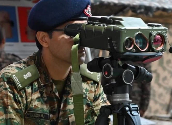
Optical sensor operator observing a distant area

What PRAHARI needed to become

What it does

PRAHARI is a counter-drone command and control interface for detecting, tracking, and neutralising low-altitude airspace threats.

Who operates it

Duty Officers in darkened signals control rooms, Sensor Operators, and Commanding Officers.

The stakes

A false negative means a missed threat. A false positive triggers a jammer on a civilian aircraft. The interface must make asymmetric risk visible.

Design partner — strategy to handoff

Our role
Design partner · strategy to handoff
Duration
14 Weeks (2023)
Team
3 Designers · 2 PMs · 15 Eng
Client
Army signals unit (withheld under NDA)

No cameras in the ops room

Two site visits to a Corps of Signals unit. No cameras, no retention of network topology data, no documentation of sensor specifications. Notebooks only. We went as observers.

Military user research

Six operator interviews and three shift handovers observed. Every insight extracted from conversation, not screen recordings. The informal fixes they'd already invented told us exactly what the software was missing.

14-week sprint

Discovery to handoff in 14 weeks. 160+ annotated screens, 43 components, interaction specs for every dynamic state, and a data model brief co-written with the dev agency's tech lead.

Going to the field

You can't design a system like this from a studio in Bengaluru. We arranged two two-day site visits to a Corps of Signals unit at a formation HQ.

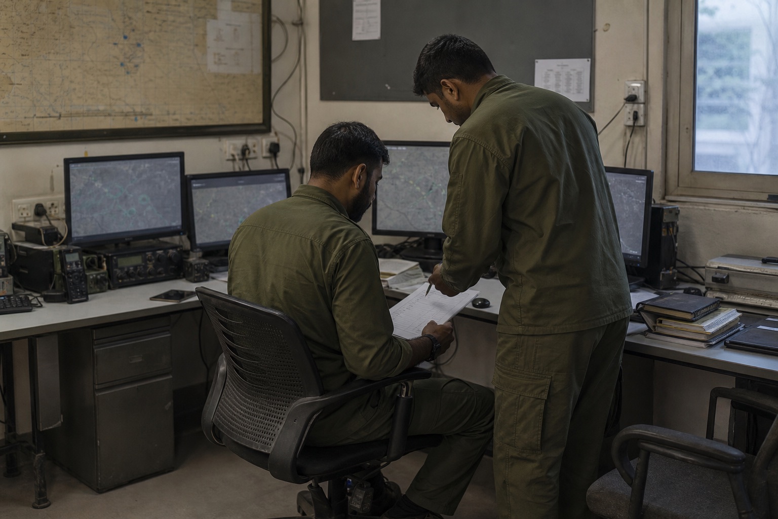
Two operators reviewing a paper handover checklist in a compact signals workspace

Reconstructed research context · The revealing behaviour was not contact detection; it was the paper-and-verbal ritual required to rebuild operational context at each shift.

What we observed

The shift handover was the most revealing ritual. Incoming operators needed 18–35 minutes of verbal briefing because there was no structured display of what was active, pending, or cleared.

We watched a duty officer handle two training-scenario drone contacts. His eyes moved between three screens. One hand on a radio. The other writing a register entry.

The mental model gap

The mental model was spatial — he thought in bearings and sectors — but his primary tool was a tabular RF signal log. There was a persistent mismatch between how the problem existed in his mind and how the tools presented it.

"I should be able to sit down cold, look at one screen, and know in five seconds whether I need to act or not." — JCO, Corps of Signals, Formation HQ

We taped that to the wall for the rest of the project.

The shift we kept coming back to

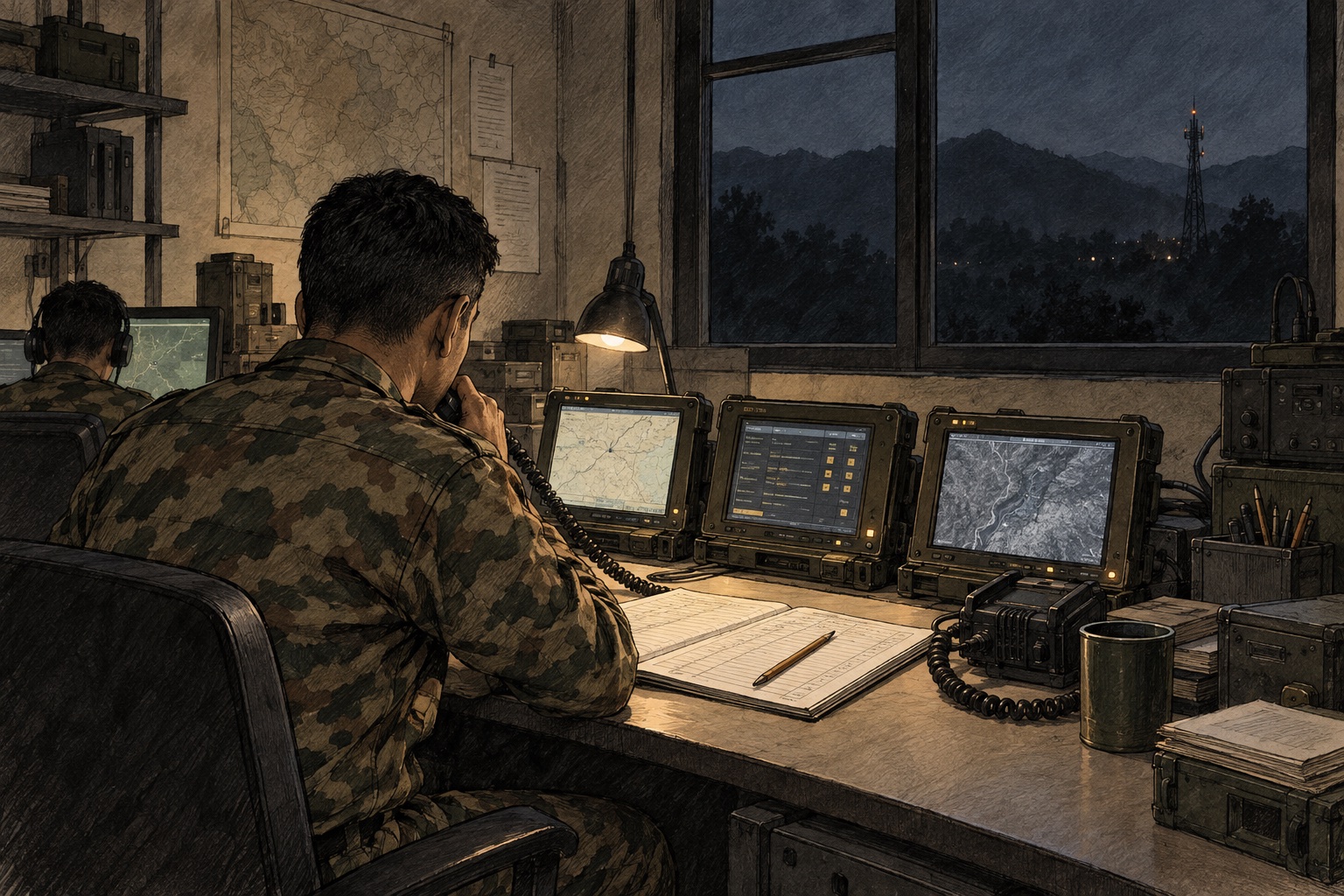
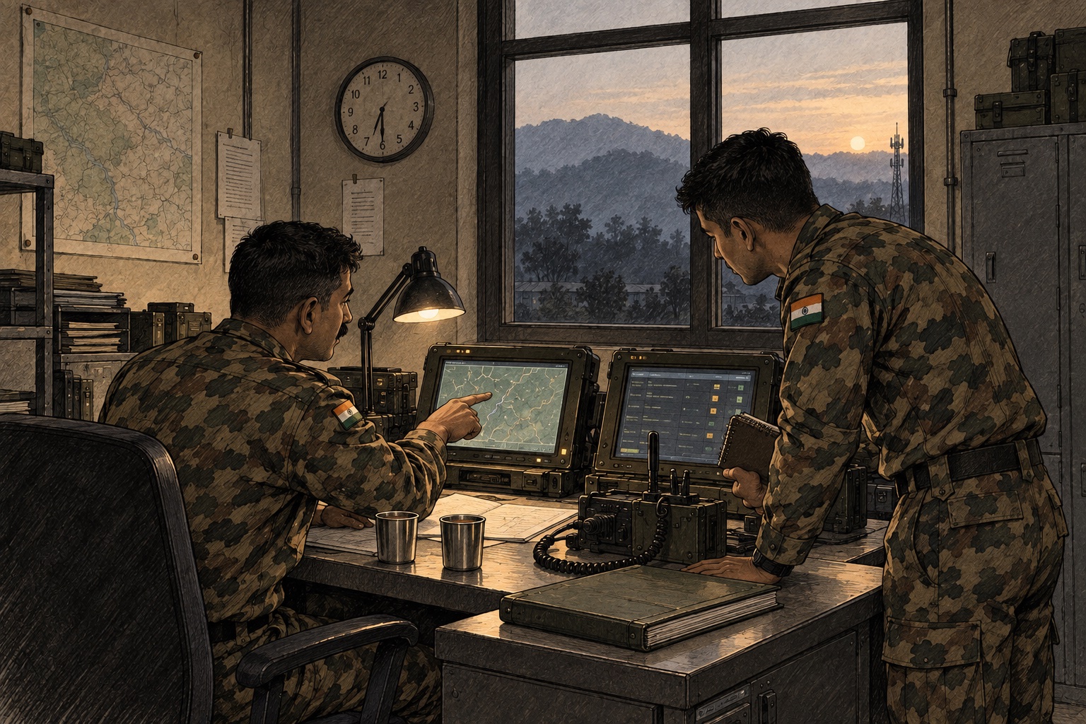
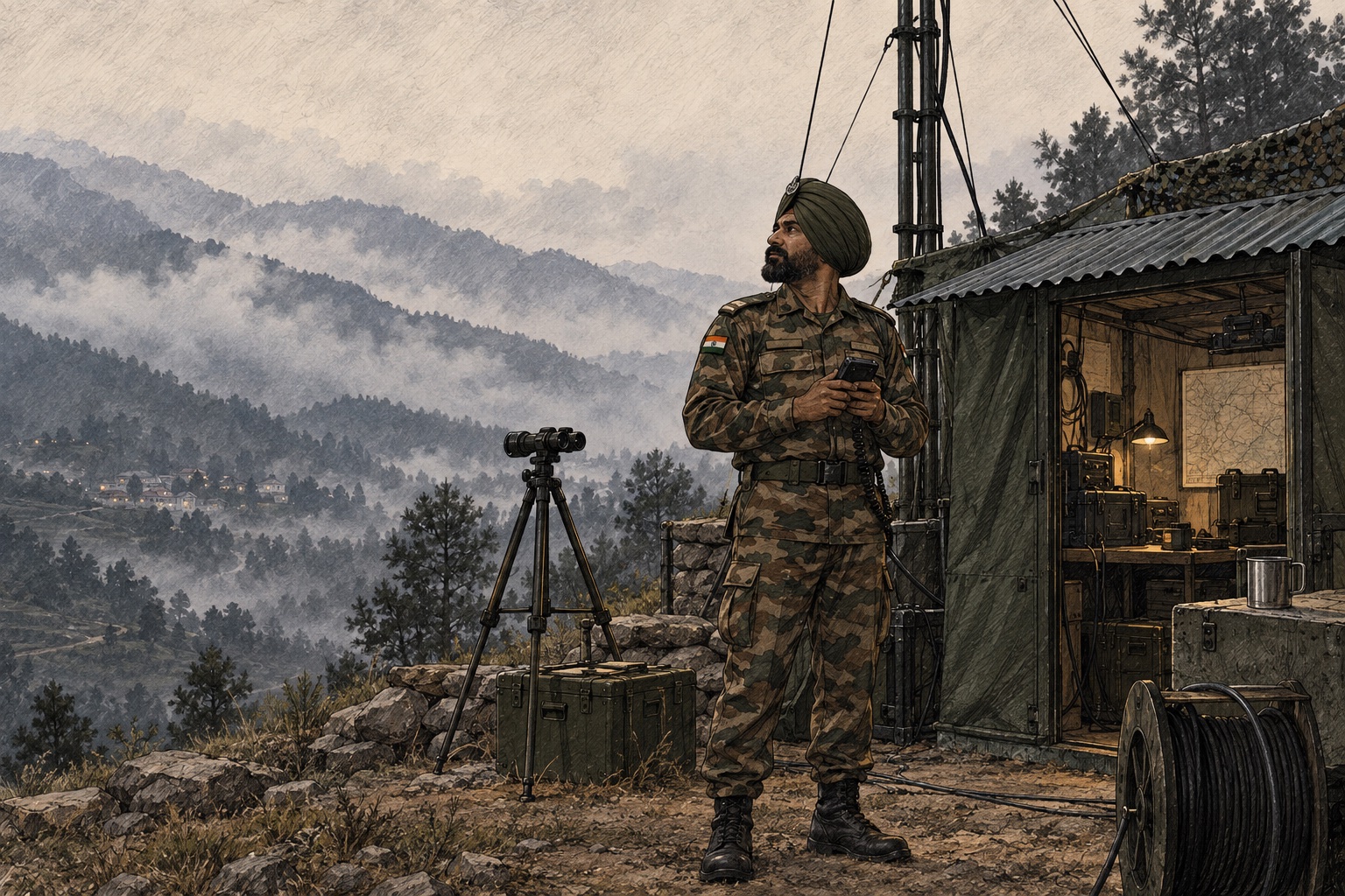
We could not photograph the site. These three illustrations reconstruct what the visits looked like — the night watch, the handover that ends it, and the forward post that both of them depend on.

Illustration of a signals duty officer on night watch: three rugged displays, a corded handset and an open paper register
Night watchThree displays, a corded handset and an open register. The whole picture exists — but only inside the operator's head.
Illustration of a shift handover at first light: one officer pointing at a display while the incoming officer takes notes
First lightThe outgoing officer talks the incoming one through everything still open. This is the 35 minutes PRAHARI had to replace.
Illustration of a forward signals post in misty foothills: an NCO with a rugged handheld beside an antenna mast and equipment shelter
The forward postEverything the operations room reasons about arrives from somewhere like this, over links that are not guaranteed.

Drawn, not photographed · Illustrated reconstructions from our field notes. No identifiable person, unit or location is depicted, and details are composited and altered under the programme's NDA.

Three structural problems

Fragmented picture. Sensor feeds were siloed. RF, radar, and optical data required mental correlation by the operator — a high-load task under pressure.

Spatial-tabular mismatch. Operators reasoned about threats in space (map, bearing, sector). Their primary interface was a table. Every decision required a translation step.

No audit trail. Engagement decisions — classify, jam, escalate — were made verbally. After-action reviews required stitching together registers, logs, and operator memory.

4-minute response gap. Against a drone doing 60 kmph, the multi-screen, multi-person, verbal-correlation process took up to 4 minutes. That's 4 kilometres of uncontested airspace.

RF detectorRadar unitOptical sensor
↓ Correlate identity, bearing and confidence
Unified objectOne contact · many sources

Three screens. Three people. Verbal correlation.

One screen. One surface. Automatic triage.

That was the design contract.

First principles before wireframes

Before we opened Figma, we ran an internal framing session around one question: What is the cost of a wrong decision — and which direction does it cut?

In C-UAS, a false negative (missed threat) is catastrophic. A false positive — triggering a jammer on a civilian aircraft — causes its own incident. The interface had to make asymmetric decision risk visible and actionable.

Principle What it meant in practice
Spatial primacy The map leads. All tabular data is subordinate and accessed in context of a selected contact.
Triage over information The interface shows three states: Act Now · Tracking · Cleared. Visual hierarchy enforces it relentlessly.
Every action leaves a trace No verbal-only decisions. Classify, jam, escalate — all auto-logged with timestamp, operator ID, and current threat state.

One screen. Five-second read.

The Threat Operations Panel is the duty officer's primary interface. Live low-altitude airspace map. Contact classification overlays. Triage queue. Contact detail panel opens inline on selection. Design target: detection to engagement decision in ≤3 interactions.

Contact Map
Map-centric — threats shown as pulsing red markers. Position and status at a glance.
prahari.ops/ops
Threat Operations Panel — map-centric with triage queue. Red contacts demand action. Amber contacts are being tracked. Everything else fades.
Triage Queue
Contacts sorted by threat level — ACT NOW first, cleared last.

Detection to Jamming: three interactions

Click a contact → review sensor data and classification → confirm electronic jam (called a "soft-kill" in military terms). The jammer activates, the map updates, the log entry writes itself. The duty officer never leaves the screen.

Interaction 1

Operator clicks contact in triage queue (or Tab to select, Enter). Contact Detail Panel opens with sensor data, bearing, distance, speed visible.

Interaction 2

Operator presses SOFT-KILL (or S key). Confirmation modal opens with jammer assignment + auto-log preview.

Interaction 3

Operator presses CONFIRM (or Enter). Jammer activates. Map shows amber zone. Status bar updates. Log entry created automatically.

The complete engagement pipeline — from first sensor contact to electronic neutralisation — designed for ≤ 5 seconds and ≤ 3 interactions.

If it's red, it demands action. Nothing else gets red.

Alarm fatigue was a documented problem in the existing setup — too many red indicators had trained operators to discount the colour. We committed to a discipline: red means act. Period. Nothing decorative, nothing ambient. If it's red, the duty officer must make a decision.

ACT NOW

Red. Pulsing marker on map. Top of triage queue. The operator must classify and respond.

TRACKING

Amber. Static marker. Middle of triage queue. Monitoring — no immediate action required.

CLEARED

Grey. Faded marker. Bottom of queue, collapsed by default. No action needed.

Eliminating the 35-minute verbal briefing

The Shift Handover Dashboard was designed to replace the 18–35 minute verbal handover entirely. A structured status snapshot readable in under 2 minutes. The design test: can a new operator walk in, read this screen, and know the full picture without speaking to the outgoing operator?

Shift Snapshot
Readable in under 2 minutes — replaces the 35-minute verbal brief.
prahari.ops/handover
Shift Handover Dashboard — intentionally calmer than the ops panel. A status surface, not a decision surface.
Active Incidents
Open incidents listed with severity — incoming operator sees what needs attention.

Every action leaves a trace

The Engagement Log was specifically designed for post-mission debriefs (the military's After-Action Review, or AAR). Every engagement decision — classify, jam, escalate, clear — auto-logged with timestamp, operator ID, and current threat state. Filterable, exportable to PDF, and dense but legible.

Auto-Logged
Every soft-kill, classify, and escalate auto-logged — operator never types a log entry.
prahari.ops/log
Engagement Log — structured rows for after-action review. Typography is dense but legible — this is a reference screen.
Filter Controls
Filter by operator, type, or time — export to PDF for AAR.

Knowing when your eyes go dark

The sensor management screen gives the sensor operator full visibility into each unit's health, coverage, and confidence rating. When OPT-3 drops to 38% confidence due to fog, the operator sees it immediately.

Coverage Grid
Sensor coverage overlap shown — blind spots visible immediately.
prahari.ops/sensors
Sensor Management — grid of sensor unit cards. Green means nominal. Amber means degraded. The operator can mark units offline with a reason field.
Confidence Rating
OPT-3 at 38% due to fog — operator sees degradation before it becomes a gap.

Decisions we cut

Predictive trajectory overlay

A visual projection of a contact's flight path. Technically feasible, but our field research showed it created false confidence. Operators anchored to the projection and stopped updating their mental model. Cut.

Cross-formation contact sharing

Allowing adjacent units to see each other's contact picture. Politically complex, technically dependent on infrastructure we couldn't guarantee. Documented as Phase 2, not killed.

160+ screens. 43 components. 15 engineers.

We handed off a Figma file with 160+ annotated screens, a component library with 43 components, interaction specs for every dynamic state, and a data model brief co-written with the dev agency's tech lead.

The keyboard-first interaction model required specific engineering coordination. We documented every keyboard shortcut, focus state, and tab order in a separate interaction spec because the duty officer scenario — high stress, hands busy, eyes on the map — made mouse-first interactions a design liability.

Deliverable Count Description
Annotated Screens 160+ Every state, edge case, and error condition documented
Component Library 43 components Contact markers, action buttons, badges, modals, sensor cards
Interaction Specs Complete Keyboard shortcuts, focus states, tab order, animation timing
Data Model Brief Co-written Contact, Event, Sensor Unit, Operator Session schemas
Critical Ops Foundation / PrahariConfidence before consequence
43 components · keyboard first
01 / StateSeverity earns colour

Red is exclusive to contacts requiring action. Amber means watch; nominal states recede.

02 / HierarchyMap, queue, detail

The spatial picture leads, triage orders attention, and detail explains the evidence behind it.

03 / ConfidenceSources stay visible

A fused answer never hides its inputs. Operators can see which sensors agree and how recently.

04 / ControlKeyboard under pressure

Shortcuts, focus order and confirmation states support eyes-on-map operation without mouse hunting.

The handover time dropped from 35 minutes to under 4.

< 4 min
Shift handover time (was 18–35 min)
≤ 3
Interactions to engagement decision
100%
Engagement actions auto-logged

That handover metric was the one we were most proud of — because it came from a user need we'd observed ourselves, not from a brief.

"I should be able to sit down cold, look at one screen, and know in five seconds whether I need to act or not." — That's exactly what they got. — Validated against the JCO's original requirement

What the project taught us

No iterative feedback access

We never got iterative feedback access to users after the field visits. Every decision after week three was made on conviction, tested against our principles, and defended in internal critique — not validated with real users.

We'd push for usability testing

If we did it again, we'd push for at least one remote usability session with operators using a high-fidelity prototype before the dev handoff. The handover dashboard would have been redesigned again.

Field visits were the foundation

When you can't ask the user, you have to know the problem well enough to argue with yourself. The field visits weren't research luxury — they were the entire foundation.

When you can't ask the user, you have to know the problem well enough to argue with yourself.