Consulting engagement under NDA, delivered with a partner agency. Client and fleet identifiers have been altered; the process and outcomes are real.
Agrodron Polska, Wielkopolska, 2024. Fourteen weeks with a two-person design team, alongside two engineers and an agronomist.

Twelve drones, 2,760 hectares, and a window that closes in 48 hours

Septoria does not wait for a spreadsheet. We designed the three interfaces that turn an agronomist's prescription into a flight plan, a night shift, and a reload bay.

Three interfaces: a planner that turns a PDF prescription into 24 sorties, a night console for 12 aircraft, and a reload bay screen readable from three metres with gloves on. Built against a treatment window of 48 hours, of which roughly 31 are actually sprayable.

The short version

A Polish agricultural cooperative runs 12 spray drones across 2,760 hectares of wheat. They had 48 hours to treat a fungal outbreak and no software to coordinate the fleet. This is the story of designing three interconnected interfaces: a mission planner, a live fleet dashboard, and a field reload station.

Reading time: ~9 minutes

The aircraft we were designing around

12 units deployed across the Kalisz cooperative fleet
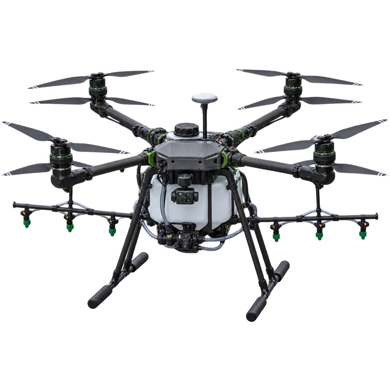
Unbranded 40-litre agricultural spray octocopter with RTK antenna, multispectral camera and eight-nozzle spray array
2.8mWingspan
40LTank Capacity
8 nozzlesSpray array
RTK GPSPositioning, ±2 cm
NDVI sensorCrop health camera
IP67Fully weather-sealed
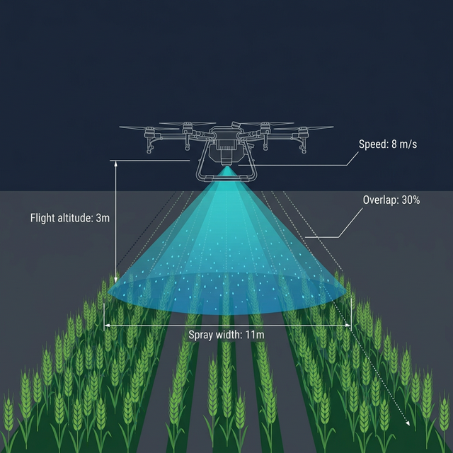
11 m spray width 25 min in the air 15 m/s top speed 4 ha per sortie before it has to come home

Company
Agrodron Polska
Our role
Design partner · three interfaces
Duration
14 weeks
Team
2 designers · 2 engineers · 1 agronomist
Platform
Desktop + Tablet PWA

The fleet tripled. The software did not.

Agrodron Polska operates Poland's largest commercial drone fleet for precision agriculture. Their service: spray fungicides, herbicides, and foliar nutrients across cooperative farmland in Wielkopolska, the country's breadbasket.

The fleet had grown from 3 drones in 2022 to 12 by 2024. The software hadn't.

Operations were coordinated through a patchwork of DJI Terra, WhatsApp voice notes, handwritten field notebooks, and a shared Google Sheet cheerfully nicknamed "the Chaos Spreadsheet." The CTO called it "air traffic control by group chat."

Legacy planning: laptop with DJI app and handwritten field notebook
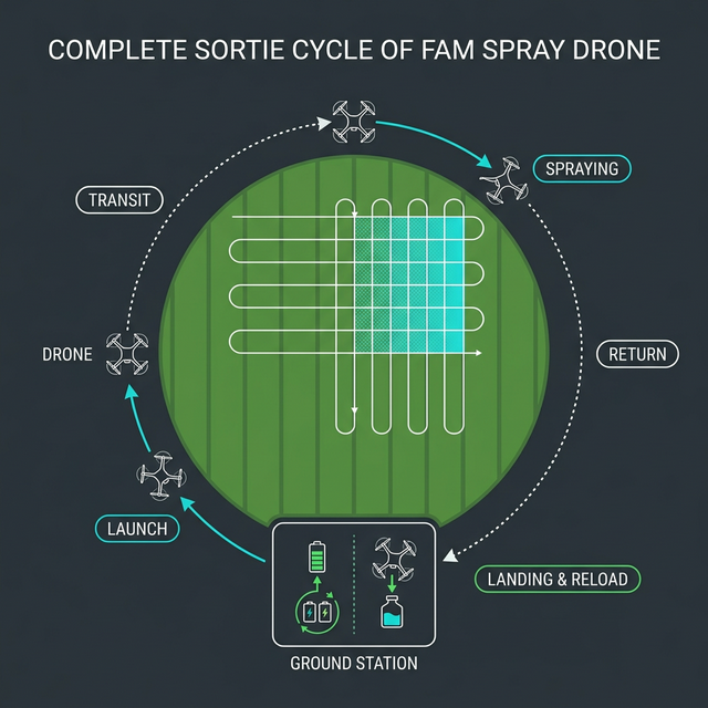
Drone spray pattern diagram showing altitude, width, overlap Complete sortie cycle: launch, transit, spray, return, reload

The product gap was obvious to everyone except the budget committee: no single interface existed for planning a multi-drone mission, monitoring real-time operations, or managing ground station logistics.

Each interface was either built for a single drone (DJI), built for a different domain entirely (Google Sheets), or built for nobody in particular (WhatsApp). The team needed one cohesive system. They named the project after the Polish word różnica, "the difference", because that's what they wanted to make.

Forty-eight hours in Wielkopolska

June 2024. Satellite imagery flagged Septoria tritici spreading across 6 cooperative wheat fields near Kalisz. The agronomist prescribed emergency fungicide treatment. The catch: Septoria has a 48-hour optimal treatment window. After that, yield losses compound exponentially.

Marek, the senior operator, attempted to coordinate the response using the existing tools.

The 48 hours, reconstructed

T+0h
Prescription received. Agronomist sends field priority map as a PDF attachment in email.
T+2h
Planning begins. Marek manually calculates sortie assignments in Excel. Three drone batteries are flat, nobody logged them.
T+4h
First drones launch. Field 1 priority unclear. Marek radios Jakub at ground station: "Which chemical does AG-03 need?" Jakub checks the notebook.
T+8h
AG-09 loses GPS signal. Hovers at last known position. Marek calls Jakub. Jakub calls the technician. 14 minutes of confusion before auto-return triggers.
T+12h
Replan needed. AG-09's remaining hectares reassigned manually. Marek updates the Google Sheet. Two operators get conflicting assignments.
T+36h
Window closing. Fields 5 and 6 still untreated. Wind picks up to 22 km/h. Drones grounded.
T+52h
Operation ends. Fields 5 and 6 receive treatment 4 hours past optimal window. Estimated yield loss: 12–15% for those fields.
"We have twelve drones that can spray a field in twenty minutes. We spent eight hours figuring out which drone goes where." Marek Kowalski, Senior Drone Operator

The Kalisz incident became the founding artefact for ROJNICA. The board approved the project the following week. We joined two weeks later.

Three days at the ground station

We spent three days embedded with the Agrodron team during a scheduled herbicide campaign. Mornings at the ground station. Afternoons in the field. Evenings transcribing notes while the drones charged.

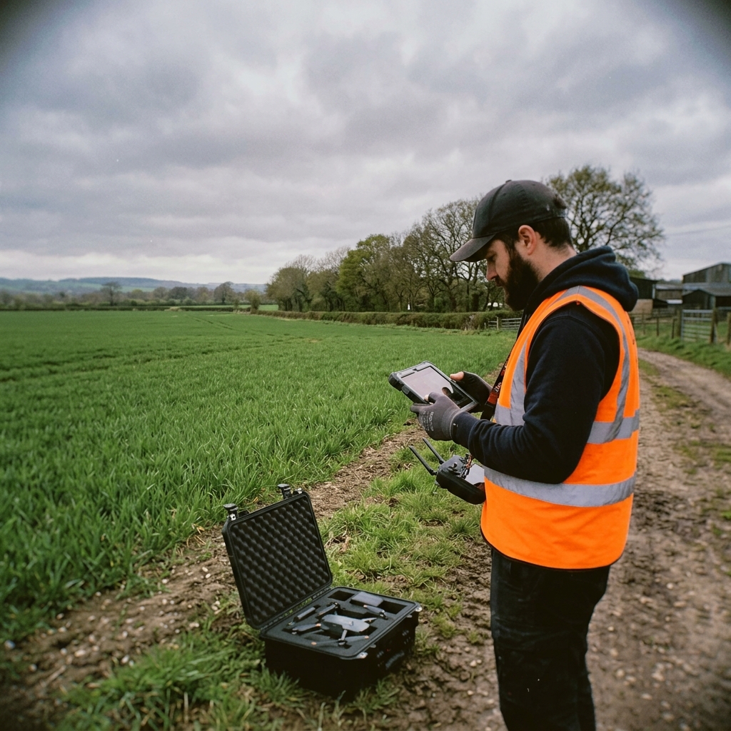
Operator at field edge with tablet

Field visits are clarifying in a way that Zoom calls never are. You learn things like: the operator doesn't look at the screen for the first 45 seconds after launch. He watches the drone. With his eyes. Because he doesn't trust the telemetry yet.

You learn that the ground station technician (Jakub) has never used a mouse. He's been farming for 30 years and started the drone work 18 months ago. His interface is a tablet, used with gloves, in direct sunlight, while a drone lands 15 metres away.

The attention split

Operators divide attention between the physical drone (eyes up) and the digital interface (eyes down). Any notification must survive this split. If it only exists on screen, it is invisible for up to 45 seconds.

An exception is not an emergency

Operators react to anomalies proportionally. A nozzle flow warning gets a glance. A GPS loss gets full attention. The interface should match this gradient, not treat every alert as a five-alarm fire.

The ground station paradox

Jakub needs the simplest interface of anyone, and his context is the most chaotic. Drones land, batteries swap, chemicals refill, all while a queue of incoming drones counts down. His UI must be scannable from 2 metres.

Planning is not operating

Mission planning happens in an office, on a desktop, with coffee. Fleet operations happen in a field, on a tablet, in the rain. These are not the same context, and they do not want the same UI.

Three interfaces, one system

The discovery findings led to an uncomfortable but necessary architectural decision: ROJNICA would be three separate interfaces optimized for three distinct contexts, connected by a shared data model.

Principle 01

Calm until it is not

Default state is minimal. Information escalates in tiers, not all at once. Green doesn't shout.

Principle 02

Attention is a budget

Every notification competes with a physical drone in the sky. Spend attention like money: sparingly.

Principle 03

Plan for the replan

No mission survives first contact with the field. Auto-reassignment is not a fallback; it is a primary feature.

Where the stakeholders pulled apart

Three users, three different needs, some directly contradictory:

Decision
Marek wants
Jakub wants
Notification urgency
Granular data, raw telemetry
"Just tell me what to do"
Replan control
Manual override on everything
Auto-approve if within tolerance
Exception display
Full telemetry data on screen
One big "problem" indicator
Chemical tracking
Inventory dashboard with forecasts
Tank level gauge, and that is it

The resolution: stratify by interface. Marek's dashboard gets the telemetry depth. Jakub's reload station gets the simplicity. The planner gets the planning. Nobody compromises on their core workflow.

The planner: turning a PDF into 24 sorties

The planner is a desktop-first application, light-themed, designed for the office environment where Marek prepares operations. It follows a three-step flow: Prescription → Fleet → Assignment.

The agronomist's prescription (field priorities, chemicals, urgency) loads into the left panel. The map renders field boundaries with priority-coded borders: red for urgent, amber for preventive, green for monitoring. No mystery colours. No legend required.

Priority Sidebar
2 of 6 fields visible, scrollable list sorted by urgency, not alphabetically.
Mission planner, prescription view: field boundaries with urgency coding, prescription sidebar with treatment details.
Field Border Colour
Red border = urgent, no legend needed. Colour IS the hierarchy.

Fleet configuration

Tab two reveals the fleet in a 2-column grid. Available drones show battery, payload, and chemical assignment. Unavailable units (maintenance, charging) grey out with reason codes. No guesswork about why AG-08 isn't in the roster.

Chemical inventory sits below, not in a separate screen, not in a modal. Right there. Because Marek told us: "I've launched drones without checking chemical stock twice. Both times were bad."

Fleet Configuration: 12 drones in availability grid, chemical inventory gauges, battery status.
Chemical Inventory
Inventory on same screen as fleet, no tab-switching to check stock.

Auto-assignment

The third tab is where the algorithm earns its keep. Click "Generate Plan" and ROJNICA assigns drones to fields, optimising for: priority (urgent fields first), proximity (minimize transit), battery efficiency (avoid mid-sortie returns), and chemical compatibility.

Plan Generation: stepped progress showing the algorithm working through field analysis, fleet checks, and route optimisation.
Progressive Disclosure
Each step completes visibly. Algorithm is a glass box, not a black box.

The result renders as colour-coded flight paths on the map and a Gantt chart at the bottom, every drone row showing its sortie sequence, reload gaps, and field assignments. The operator can read the entire 6-hour operation at a glance.

Gantt Chart
Not in the spec. Operators asked for it after first prototype. Now their primary briefing tool.
Auto-Assignment: colour-coded flight paths on map, Gantt chart below with sortie sequence and reload gaps.

The console: twelve aircraft at two in the morning

The dashboard is the centrepiece. Dark mode. Real-time. Designed to run on a large monitor at the ground station during active operations.

The core design philosophy: calm by default. When 10 drones are flying nominally, the screen is almost boring. Muted field outlines, small chevron markers drifting across the map, a green "ALL NOMINAL" badge so understated you barely notice it.

"If your dashboard looks exciting during normal operations, your dashboard is broken." A design principle we will die on a hill for
Fleet Dashboard, nominal state. All systems green. The calm screen the operator hopes to see all shift.
All Nominal
Deliberately understated, green doesn't shout. Calm is safe.
Attention Sort
Exceptions float to top, nominal drones drift down automatically.

Three tiers of exception

The escalation system has three tiers, each calibrated to the operator's real-world response gradient:

Tier 1: worth knowing

Log entry only. No visual change. "AG-07 completed sortie 2." The operator doesn't need to know this urgently. It's there when they check.

Tier 2: worth a look

Amber card border. Pulsing map ring. Notification slides in from the right with context and two action buttons. "Crop stress detected in northeast sector of Pole Wschodnie." Operator decides: redirect or mark for follow-up.

Tier 3: act now

Red card. Dashboard dims. Blinking map marker. Auto-return countdown begins. "AG-09: GPS LOST. Hovering at last known position." The operator has two choices: return now or hold position. Nothing else matters.

Tier 2 Exception: AG-03 flagged with amber pulsing ring, notification panel with action buttons.
Tier 3 Critical: AG-09 GPS loss, dashboard dimmed, blinking marker, auto-return countdown at 54 seconds.

The replan cascade

When a drone is withdrawn, GPS loss, mechanical failure, nozzle malfunction, its remaining hectares need redistribution. In the old system, this was a 14-minute WhatsApp scramble. In ROJNICA, it's a modal.

The replan modal shows the affected fields, the original paths (dashed), the proposed new paths (solid), and a table of reassignments with added time per drone. One button: approve. One button: modify. Average decision time in testing: 8 seconds.

Replan Modal: AG-09 withdrawn, 140 ha redistributed across 3 drones, impact summary, approve/modify actions.

The reload bay: gloves on, three metres back

Jakub's interface. Tablet-optimised. Dark mode for outdoor visibility. And the design constraint that made it interesting: 56-pixel minimum touch targets, because Jakub wears gloves.

The reload view is deliberately simple. An incoming drone queue with countdown timers. Each card shows what needsto happen: battery swap, chemical reload, nozzle check. A fat A single wide button to mark the bay ready. A recently-launched log at the bottom so he can confirm what he just sent back up.

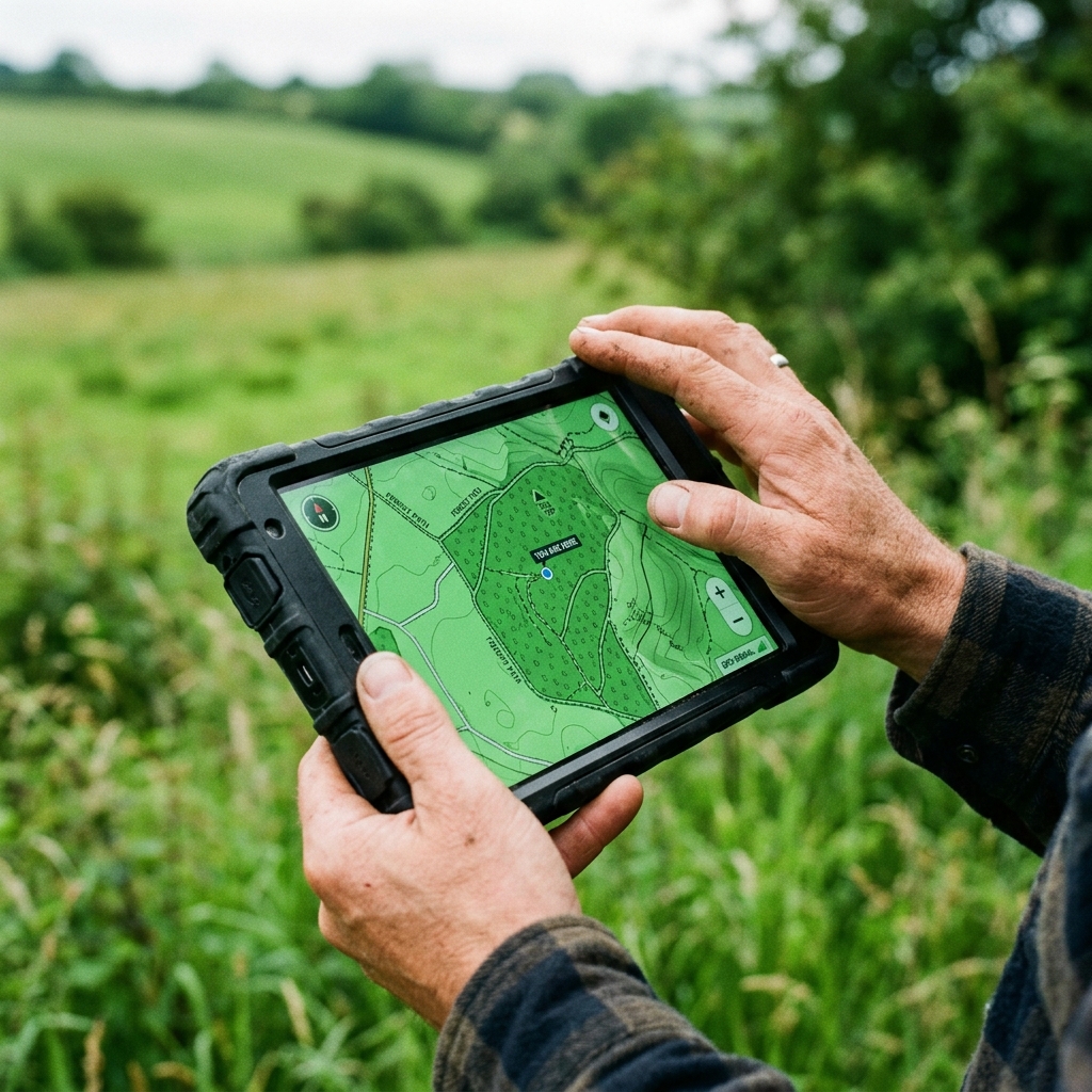
Operator viewing drone telemetry on tablet in the field
Reload Station: large touch targets, 3-step reload verification sequence, chemical level gauges.
56px Targets
Sized for gloves in direct sunlight, Jakub's exact constraint.

The inventory gauges in the top bar are Jakub's only dashboard. Fungicide A level. Fungicide B level. Available batteries. That's it. He doesn't need to know about the agronomist's prescription or the overall field progress. His world is the landing pad, and the UI respects that boundary.

What happened when they ran Kalisz again

ROJNICA deployed for a pilot season covering two cooperative campaigns. The numbers told the story we hoped for, and one we didn't expect.

52 hours
6h 15m
Planning time for similar operation
14 min avg
8 sec
Exception-to-replan resolution
4h past window
0h
Treatment window overruns

The Kalisz replay

The real test came when Septoria returned to the Kalisz cooperative in the second campaign season. Same pathogen. Same 48-hour window. Same 2,760 hectares. Different outcome.

Marek loaded the prescription at 07:00. Generated the mission plan by 07:12. First drones launched at 07:30. AG-09 threw a nozzle warning at 09:15, Tier 2, handled in 12 seconds with a redirect to the nearest reload station. All six fields treated within 38 hours. Ten hours inside the window.

"Last year Kalisz nearly cost us. This year I was home for dinner." Marek Kowalski, Senior Drone Operator

What we would do differently

The offline resilience layer was under-specified. We designed for it but didn't prototype the local-first data sync thoroughly enough. When Jakub's tablet lost connectivity for 90 seconds during a reload cycle, the queue froze. Fixable, but should have been caught in testing.

What worked: the three-interface architecture. Separating planner, dashboard, and reload station into optimised contexts prevented the feature creep that makes agricultural software unusable. Jakub never had to see a Gantt chart. Marek never had to think about battery swap checklists. Each interface respected its user's attention budget.

What surprised us: the operators started using the Gantt chart for shift handovers. We hadn't designed for it, but the timeline view became a de facto briefing tool. Sometimes the best features are the ones you didn't intend.